6.6.B.11 -Describing Distributions Using the Mean and MAD – Exit Ticket
star
star
star
star
star
Sidst opdateret over 4 years ago
3 Spørgsmål
10
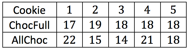
Draw a dot plot for each set of data that shows the distribution of number of
chips for each brand. Use a scale for your dot plots that covers the same span
for both distributions.
Draw a dot plot for each set of data that shows the distribution of number of chips for each brand. Use a scale for your dot plots that covers the same span for both distributions.
10
10