Algebra 2 2-5 Guided Practice: Using Linear Models
star
star
star
star
star
Posljednje ažuriranje almost 4 years ago
24 questions

3
3
10
20
A.CED.2
F.IF.4
10
F.IF.4
F.IF.6
20
A.CED.2
F.IF.4
10
F.IF.4
F.IF.6
3
3
10
![]()
Video Check: Select all that apply with regards to the video embedded directly above this item.

How many hours should you work to earn $200? Enter only a whole number. Your response is only an approximation based on the trend of the data in the graph.
What assumptions did you make to find your answer? Explain.
![]()
Video Check: Select all that apply with regards to the video embedded directly above this item.

Take Note: Define scatter plot. You may use the canvas to help illustrate your written response.
Take Note: Define correlation. You may use the canvas to help illustrate your written response.
![]()
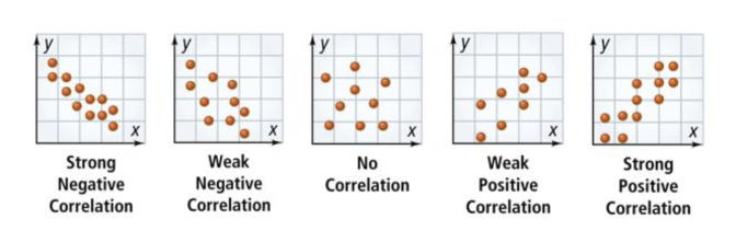
Take Note: Categorize each scatter plot on the left based on the type of correlation it displays.
You may need to zoom out to see all of the items. You can also place each item from the left column by selecting it (click it) then selecting (clicking on) the category for it.


Strong negative correlation
Weak negative correlation
No correlation
Weak positive correlation
Strong positive correlation
Problem 1 Got It? The table shows the numbers of hours students spend online the day before a test and the scores on the test. Make a scatterplot of these data on the canvas. Use colors that stand out and include all relevant graph detail.

Problem 1 Got It? How would you describe the correlation between the variables in the table? Explain.
Hint: It may be helpful to refer to the scatter plot you created in the previous item.

Problem 1 Got It? Now, use the Desmos graphing utility at desmos.com/calculator to plot the same data.
Click the + button and add a table.
Input the hours from the table into the x₁ column.
Input the test scores from the table into the y₁ column.
Zoom and pan your graph to establish a suitable viewing window. (You may use the wrench button to manually fine-tune your viewing window.)
Take a screenshot of your scatterplot.
Paste (or upload) the screenshot image of your scatter plot to the canvas.

Problem 1 Got It? Reasoning: Using the graph from Problem 1, how much would you expect to pay for electricity if the average temperature was 70°F? Explain.
You may use the canvas to help illustrate your written response.

![]()
Video Check: Select all that apply with regards to the video embedded directly above this item.

Take Note: Define trend line. Be sure to describe how trend lines are useful. You may use the canvas to help illustrate your written response.
Take Note: Summarize the process of writing the equation of a trend line from given data. You may use the canvas to help illustrate your written response.

Problem 2 Got It?
![]()
Video Check: Select all that apply with regards to the video embedded directly above this item.

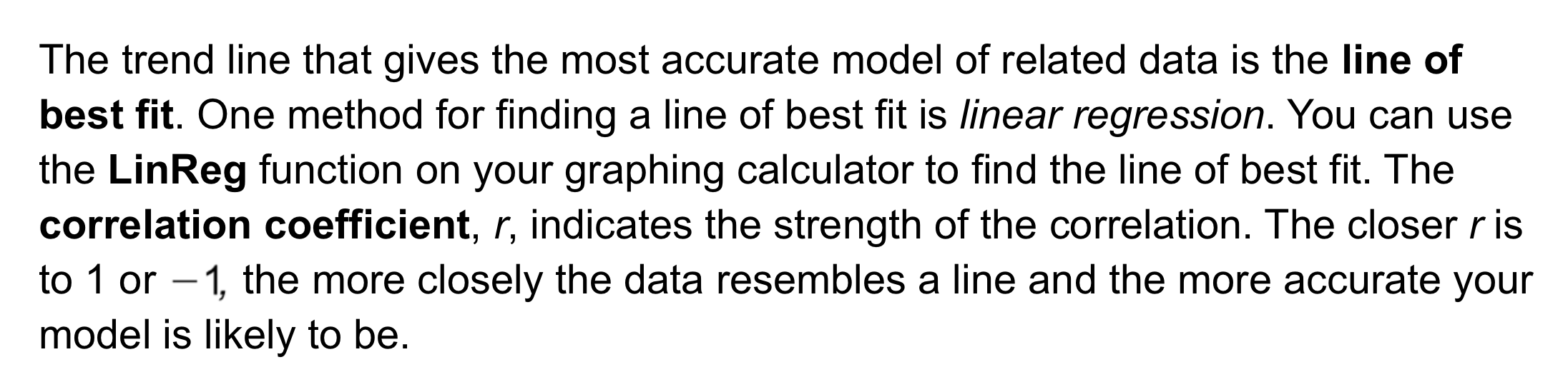
Take Note: A line of best fit is a particular type of trend line. Define line of best fit. You may use the canvas to help illustrate your written response.
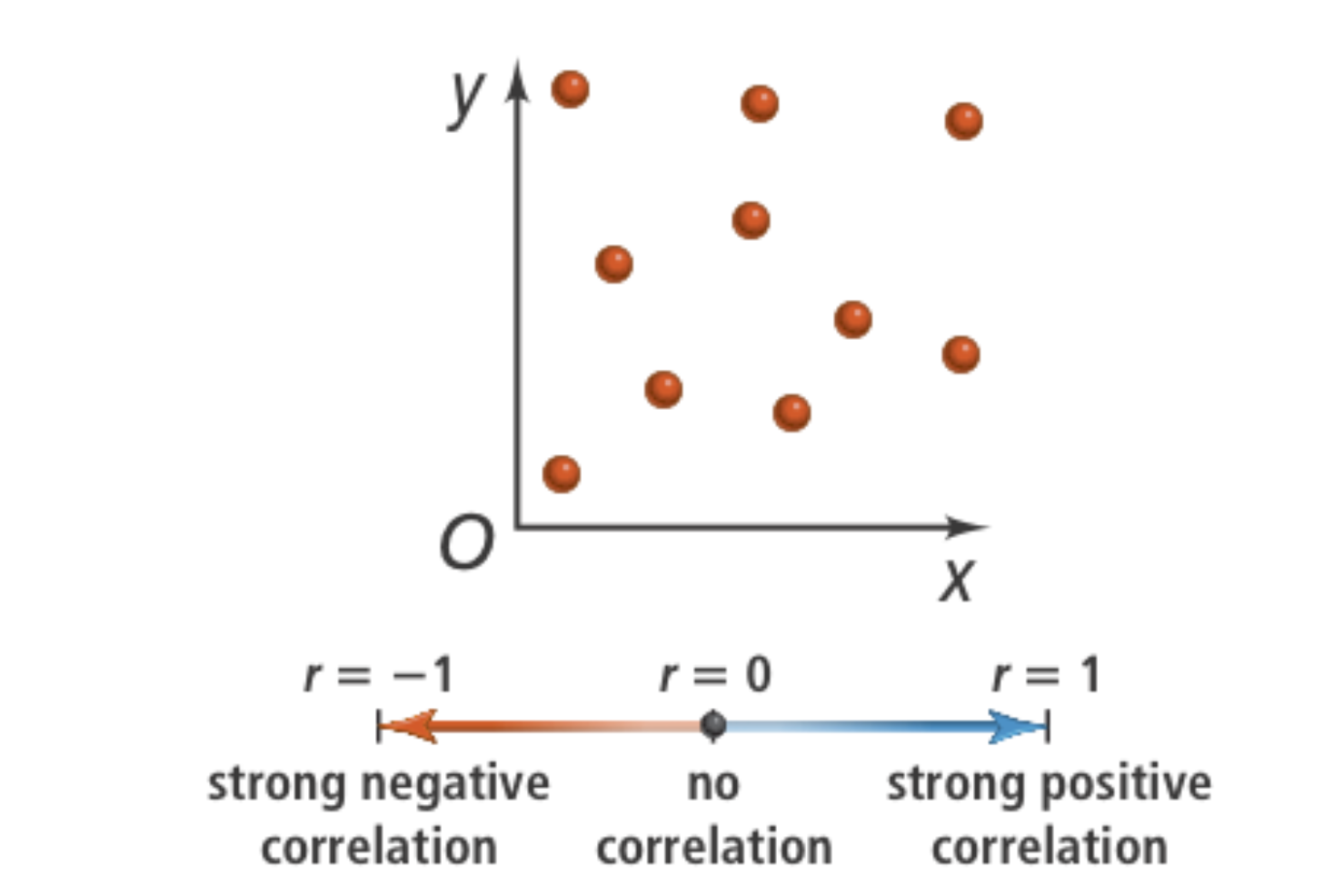
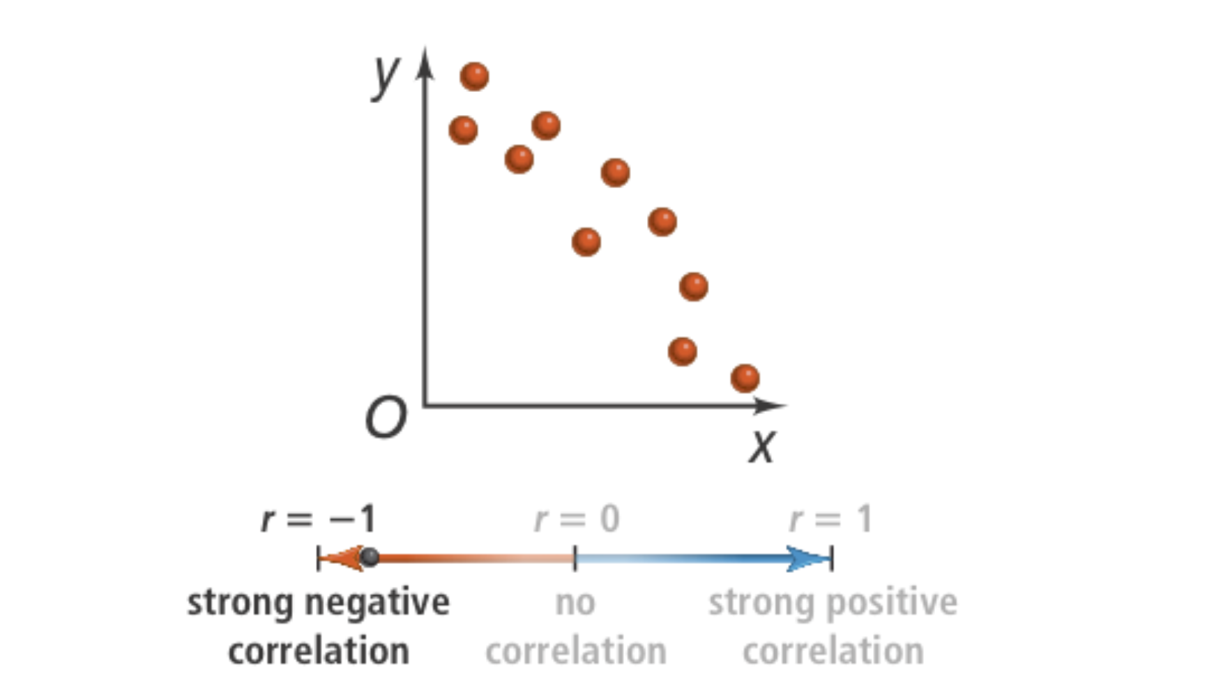
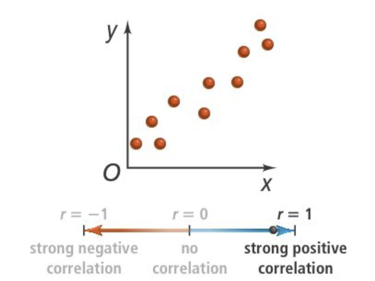
Take Note: What is a correlation coefficient? You may use the canvas to help illustrate your written response.
![]()
Take Note: Match each scatter plot on the left with its approximate correlation coefficient value on the right.
| Stavka koja se može prevući | arrow_right_alt | Odgovarajuća stavka |
|---|---|---|
| arrow_right_alt | |
| arrow_right_alt | |
| arrow_right_alt |


🧠 Retrieval Practice:
Summarize the mathematical content of this lesson. What topics, ideas, and vocabulary were introduced?
Take Note: What does it mean when the correlation coefficient of a line of best fit is close to 1? You may use the canvas to help illustrate your written response.
Take Note: What does it mean when the correlation coefficient of a line of best fit is close to -1? You may use the canvas to help illustrate your written response.
Take Note: What does it mean when the correlation coefficient of a line of best fit is close to 0? You may use the canvas to help illustrate your written response.


