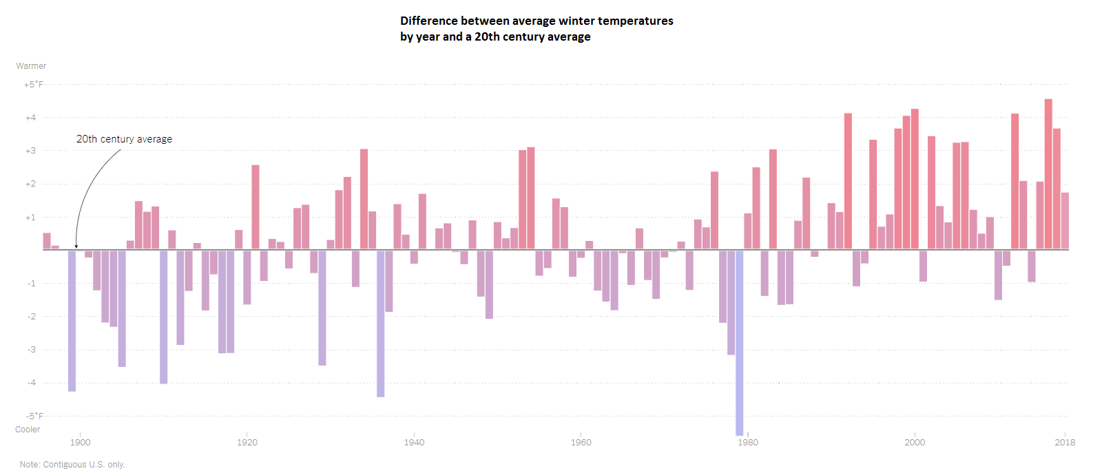
Winter Temperatures - Graph 2019/01/17
The questions are intended to build on one another, so answer them in order in paragraph form.
Start with “I notice,” then “I wonder,” and end with “The story this graph is telling is ….”
An example of the expectation for a completely different graph:
"I noticed that many of the immigrants have moved to the southern and western states such as, California and Texas. These people should be given a chance and not rejected right away. The chart also shows how many of these immigrants have jobs and are working people. I wonder why these people came to those exact states. I also wonder why they moved up north, why would they go so far up north. The story these graphs are showing is where the immigrants went and how many of them people working in that state."
Write a catchy headline that captures the graph’s main idea.
Write a catchy headline that captures the graph’s main idea.