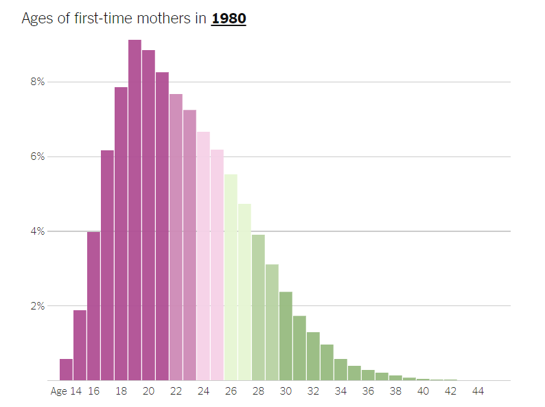
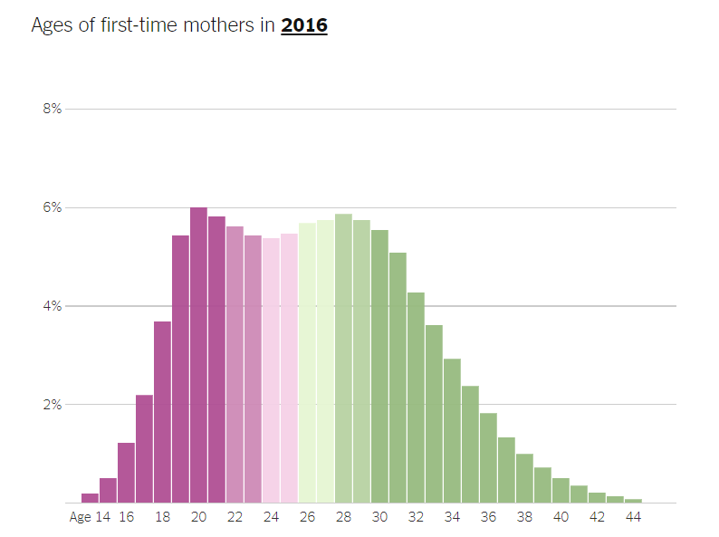
What's going on in this graph? - Ages of First Time Mothers
star
star
star
star
star
Posljednje ažuriranje over 6 years ago
2 questions
10
5
The questions are intended to build on one another, so answer them in order in paragraph form.
Start with “I notice,” then “I wonder,” and end with “The story this graph is telling is ….”
An example of the expectation for a completely different graph:
"I noticed that many of the immigrants have moved to the southern and western states such as, California and Texas. These people should be given a chance and not rejected right away. The chart also shows how many of these immigrants have jobs and are working people. I wonder why these people came to those exact states. I also wonder why they moved up north, why would they go so far up north. The story these graphs are showing is where the immigrants went and how many of them people working in that state."
Create a meme that captures the main idea presented in the graphs AND is supported by the information shown. You may use any meme creator or simply use Google Draw.
Upload your Meme as your response
For examples for a completely different set of images click here.
If you'd like to have your classmates look at your meme, you may publish it in this padlet - https://padlet.com/mgarcia31/z5qp2tnczxtk. When you publish it, make sure you reference the name of the formative AND include a link to the original graph - https://nyti.ms/2Hh6wPW . Your classmates will have the opportunity of voting on it and perhaps it will be published as an exemplar. However, remember that your meme must be supported by the graph. Random memes will be deleted AND will make you lose points for the assignment.