Hurricane Forecast 9/11
star
star
star
star
star
Posljednje ažuriranje over 6 years ago
4 questions
1
1
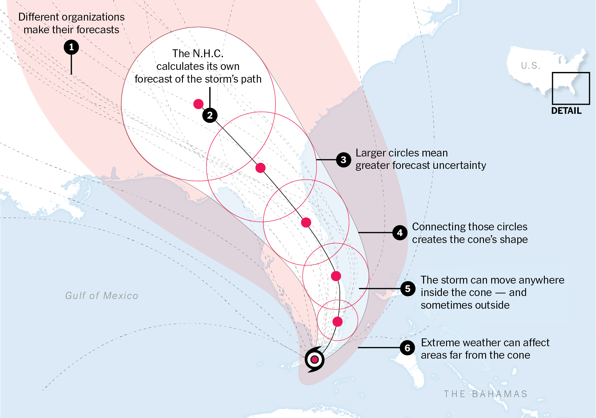
Notice the dotted lines. What do you think they represent?
Notice the dotted lines. What do you think they represent?
1
1
Notice the dotted lines. What do you think they represent?
Look at the labels for the circles. What does the size of the circles represent?
Now that you know how to read a hurricane forecast map, consider these three forecast maps of Hurricane Dorian created over one week.

Use them to write a rebuttal to the following claim made on September 1: "In addition to Florida - South Carolina, North Carolina, Georgia, and Alabama, will most likely be hit (much) harder than anticipated."
To write your rebuttal, you must use the CER framework (if you do not know what this means exactly open https://mariana68.wixsite.com/adventurescience/cer-frames)
Write a >140 character Tweet that could accompany the sharing of the of the map/image.
This means, you would write a short sentence or two that describes one surprising thing you noticed from the map and you accompany it with one or two relevant hashtags.