Measuring poverty and inequality
star
star
star
star
star
Last updated almost 5 years ago
11 Nsɛmmisa
MEASURING POVERTY:
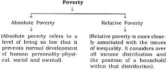
When it comes to poverty, we distinguish between absolute and relative poverty.
1
1
1
Let's see how it looks on a global scale:
1
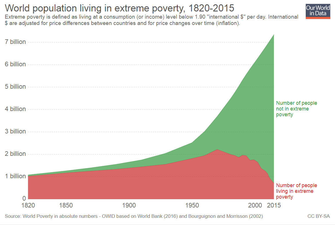
As you can see on the graph below, worldwide extreme (absolute) poverty is declining:
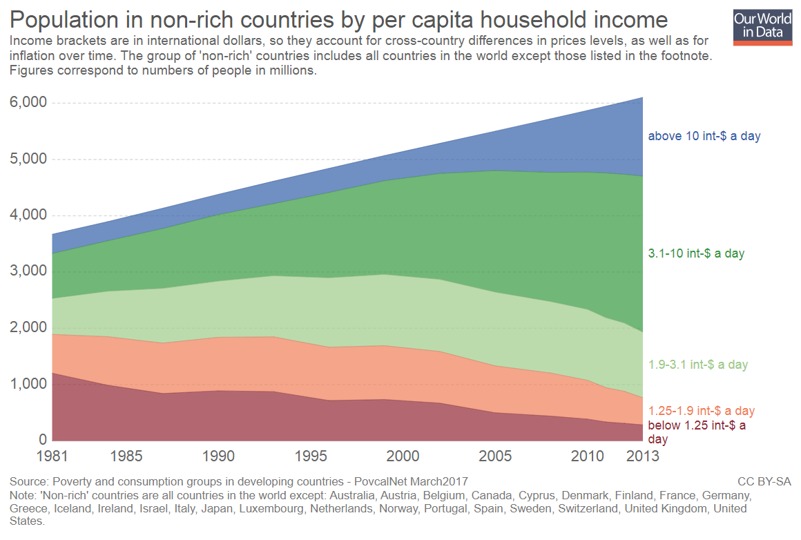
However, due to economic inequality billions still live for less than couple dollars a day:
MEASURING INEQUALITY:
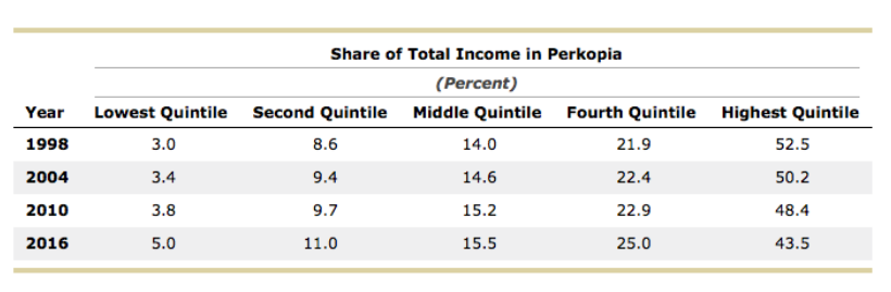
Income inequality can be measured in three ways:
1) by comparing incomes od different quintiles of society
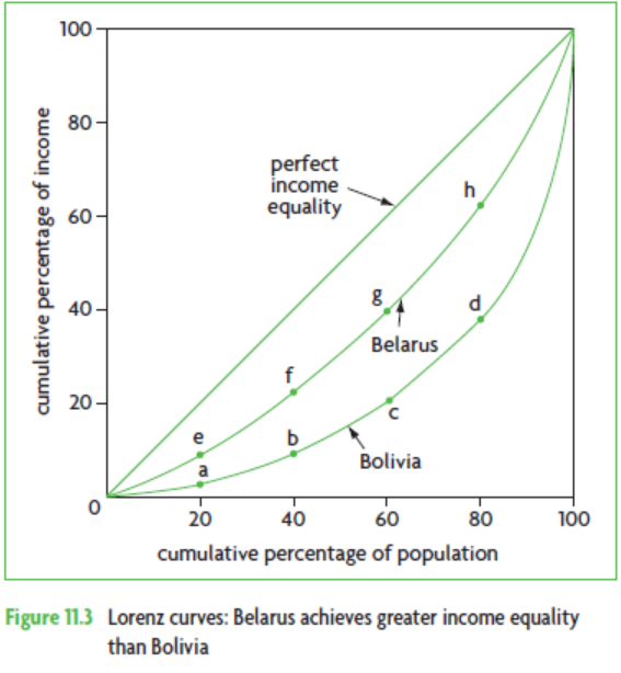
2) using Lorenz curve
3) with Gini coefficient
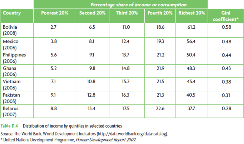
Let's begin with analysing this table:
1
1
1
1
1
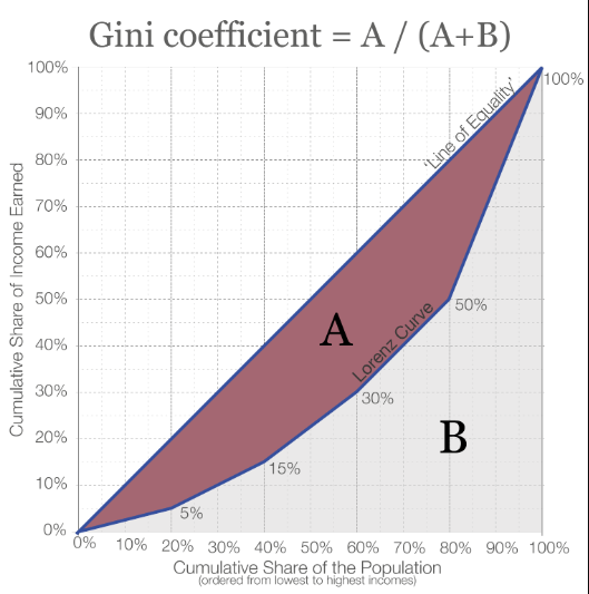
The Gini coefficient has a value between 0 and 1. If there were perfect income equality, the coefficient would be zero, since the numerator of the ratio would be zero.
The larger the Gini coefficient, and the closer it is to 1, the greater is the income inequality, since the further away is the Lorenz curve from the diagonal.
1
1