The following histogram represents the length of textbooks in pages.

Which range of pages is the most common?
The following histogram represents the length of textbooks in pages.
Which range of pages is the most common?
The following histogram represents the length of textbooks in pages.
Which range of pages is the most common?
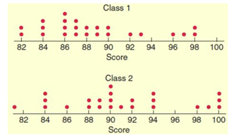
What is the median for Class 1? If necessary, round to the nearest tenth.
What is the median for Class 2? If necessary, round to the nearest tenth.
A class tracked the hours each student played games per month.
In total, how many hours were spent gaming by all students?
The grades for a math test were distributed in a box-and whiskers plot as shown.
What is the median score on the math test?
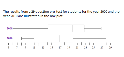
Which year had a larger median?
What is the IQR for 2000?
For the given box plot find the 5 key values and the IQR.
Drag the munber in the right column, to the correct label in the right column.
| Draggable item | arrow_right_alt | Corresponding Item |
|---|---|---|
28 | arrow_right_alt | Minimum |
8 | arrow_right_alt | Maximum |
16 | arrow_right_alt | Median |
26 | arrow_right_alt | Q1 (1st Quartile) |
22 | arrow_right_alt | Q3 (3rd Quartile) |
18 | arrow_right_alt | IQR (Interquartile Range) |
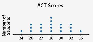
What is the mean score? If necessary, round to the nearest tenth.
What is the median score? If necessary, round to the nearest tenth.
What is the range of scores? If necessary, round to the nearest tenth.
The two-way tables shows the results of a survey of 100 adults who were asked to pick their favorite genre of music from Jazz, Rock, Classical, or Folk.
Complete the table to show the amounts that go in each of the boxes.
Click on "Show your work" and then draw or type in the missing values.
John is a shop keeper. He sold cameras over a month and wrote the sale of total number of cameras he sold each day. The results are shown as below; organize them in order, complete the frequency table and drawe the histogram with given interval.
10, 12, 15, 14, 25, 5, 26, 21, 13, 14, 19, 9, 18, 14, 16, 24, 26, 21, 23, 20, 23, 20, 11, 8, 21, 26, 27, 12, 26, 13
Click on "Show your work" and then fillout the frqency table and complete the histrogram.
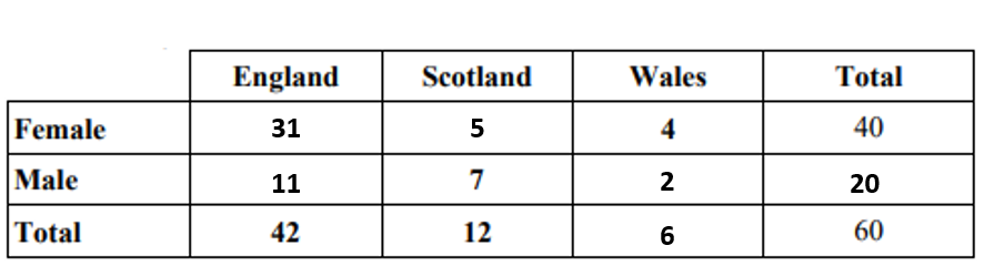
What’s the joint frequency of a Scottish female? Write your answer as a simplified fraction.
What’s the marginal frequency of Welch surveyed? Write your answer as a simplified fraction.
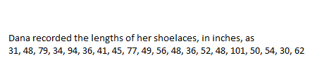
Make a stem and leaf plot for data.
Click on "Show you work" and then draw or type in the necessary information.
What is the median shoelace length? If necessary, round to the nearest tenth.
What is the mode of her shoelace lengths? If necessary, round to the nearest tenth.
What is the range of her shoelace lengths? If necessary, round to the nearest tenth.
The following graph presents the distribution of students’ scores. You’ve been asked to discuss the distribution with your class. How might you characterize it?
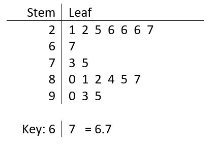
What does the value 8|0 represent?
What is the median for the data? If necessary, round to the nearest tenth.
What is the average for the data? If necessary, round to the nearest tenth.
What is the relative frequency of 2.6? Write your answer as a simplified fraction.
Four graphs of different data sets are shown. Which data set has the greatest standard deviation?
The table shows preferences for males and females of Sport Utility Vehicles (SUV) and Sports Cars.
What is the difference in the frequency of females that prefer sports cars to males who prefer SUVs?
Which class has a larger range?
For Class 1, is the mean greater or less than the median.
Which year had a larger range?
Approximately how many percent more students were above 20 correct in 2000, compared to 2010?


