Myths of Climate Change from NASA
star
star
star
star
star
Last updated over 5 years ago
9 Nsɛmmisa
Hyɛ no nsow a efi ɔkyerɛwfo no hɔ:
Based on information provided by NASA
1
1
1
1
1
1
1
1
1
Based on information provided by NASA
Watt, unit of power in the International System of Units (SI) equal to one joule of work performed per second, or to 1/746 horsepower. https://www.britannica.com/science/watt-unit-of-measurement
Celsius, also called centigrade, scale based on 0° for the freezing point of water and 100° for the boiling point of water.
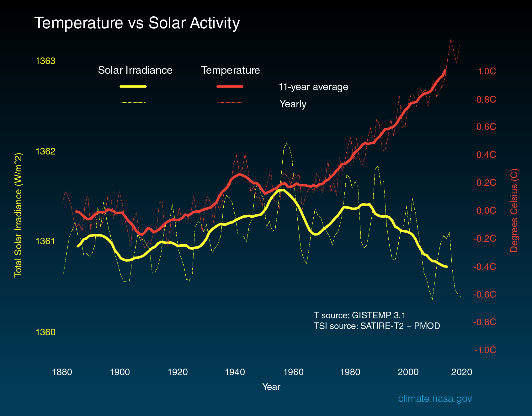
The above graph compares global surface temperature changes (red line) and the Sun's energy received by the Earth (yellow line) in watts (units of energy) per square meter since 1880. The lighter/thinner lines show the yearly levels while the heavier/thicker lines show the 11-year average trends. Eleven-year averages are used to reduce the year-to-year natural noise in the data, making the underlying trends more obvious.
The amount of solar energy received by the Earth has followed the Sun’s natural 11-year cycle of small ups and downs with no net increase since the 1950s. Over the same period, global temperature has risen markedly. It is therefore extremely unlikely that the Sun has caused the observed global temperature warming trend over the past half-century.
Answer after looking at the above graph and reading the description below it:
Why does the graph include the 11 year averages of the sun's yearly irradiance and global temperatures?
Answer the question based on the above graph. Between which decades can you see the greatest increase in Earth's 11 year average temperature.
Based on the above graph, is the increase in the 11 year average of Earth's temperature since 1960 likely due to solar activity.
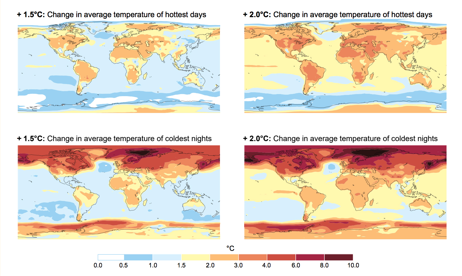
A key point of the special report (IPCC) is there is no single 1.5-degree warmer world.
The impacts of climate change haven’t been spread evenly around our planet and they won’t be in the future, either. Temperatures increase at different speeds everywhere, with warming generally higher over land areas than oceans. The strongest warming is happening in the Arctic during its cool seasons, and in Earth’s mid-latitude regions during the warm season.
In many regions, warming has already surpassed 1.5 degrees Celsius above pre-industrial levels. More than one-fifth of all humans live in regions that have already seen warming greater than 1.5 degrees Celsius in at least one season. Climate-related risks were found to be generally higher at lower latitudes and for disadvantaged people and communities.
Temperature change is not uniform across the globe. Projected changes are shown for the average temperature of the annual hottest day (top) and the annual coldest night (bottom) with 1.5 degrees Celsius of global warming (left) and 2 degrees Celsius of global warming (right) compared to pre-industrial levels. Credit: FAQ 3.1, Figure 1 from the Intergovernmental Panel on Climate Change Special Report on Global Warming of 1.5º Celsius (2.7º Fahrenheit)
Which set of climate images above reflect changes in summer temperatures?
Which set of climate images above reflect changes in winter temperatures?
Where is the greatest warming occuring?
Climate related risks to humans are seen in the lower latitudes (closer to the equator) and for disadvantaged people and communities.
This visualization shows sea surface temperature (SST) data from January 2016 through March 2020. Ocean temperatures are displayed between 0 degrees Celsius (C) and 32 degrees C.
Sea surface temperature (water temperature at the sea's surface, where the ocean is in direct contact with the atmosphere) plays a large role in climate and weather. For example, every 3 to 7 years, a swath of the Pacific Ocean along the equator warms by 2 to 3 degrees Celsius (3.6 to 5.4 degrees Fahrenheit). This warming is a hallmark of the climate pattern El Niño, which changes rainfall patterns around the globe, causing heavy rainfall in the southern United States and severe drought in Australia, Indonesia and southern Asia.
On a smaller scale, ocean temperatures influence the development of tropical cyclones (hurricanes and typhoons), which draw energy from warm ocean waters to form and intensify.
Why is it important to record global temperatures on land and sea over time?
Using your graph reading skills, watch the above animation. Based on this animated graph, what factor corresponds closely to the increase in Earth's average temperature since 1880?