CARBON THROUGH THE SEASONS
star
star
star
star
star
Posljednje ažuriranje almost 2 years ago
18
1
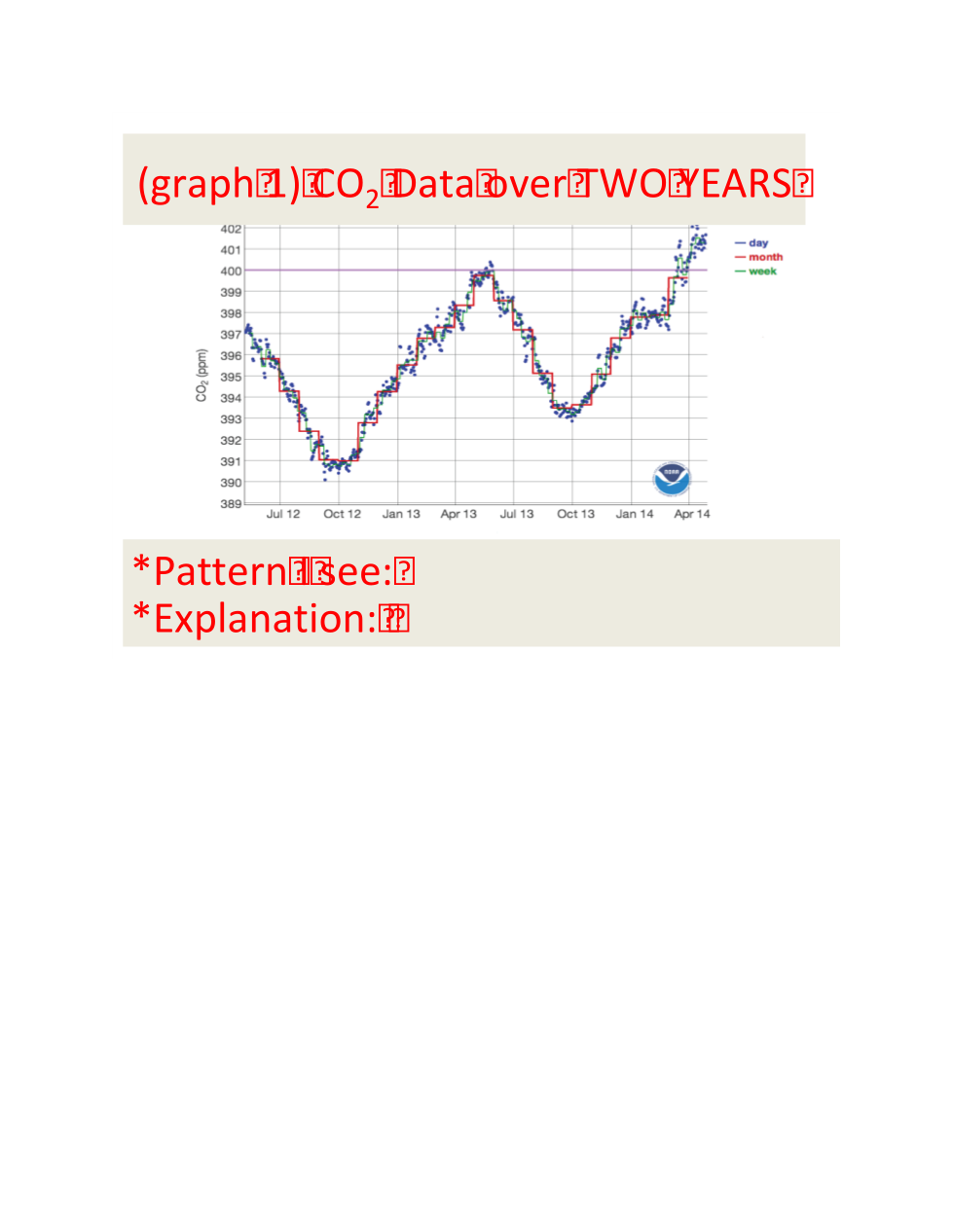
Identify the PATTERN you see in this Graph 1?

Identify the PATTERN you see in this Graph 1?
1
Identify the PATTERN you see in this Graph 1?
How can you EXPLAIN this pattern in Graph 1?
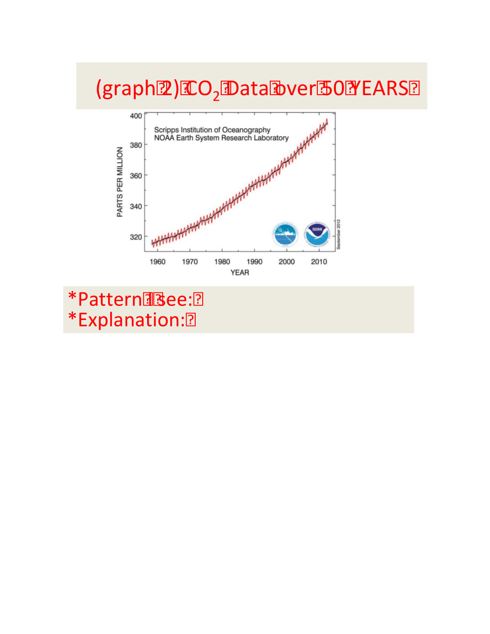
Identify the PATTERN you see in this Graph 2?

How can you EXPLAIN this pattern in Graph 2?

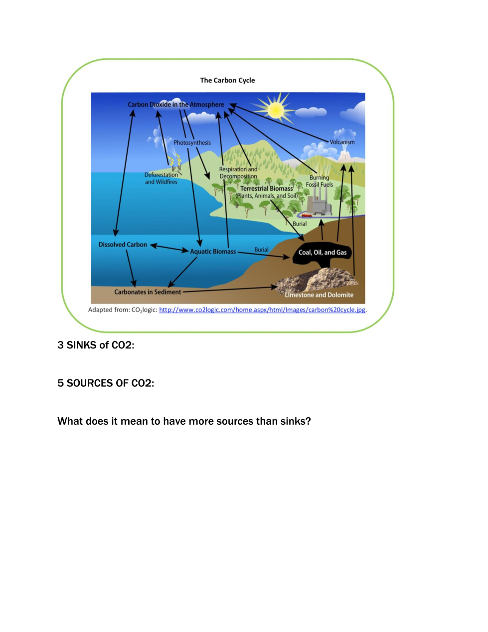
Which are the 3 SINKS of CO2?

Which are the 5 SOURCES of CO2?

What does it mean to have more sources than sinks of CO2?

TRY to set up how you would graph this data.
1. With the Line Tool, draw the X and Y axes.
2. With the Scribble Tool, label what you think would go on each axis.
3. With the Text Tool, label what each axis title would be.
What MOLECULE of matter was measured with all this data?
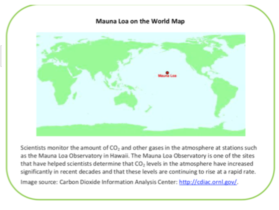
WHERE was this data collected from? (Click on "e" from page 1)
Are the seasons the same in the Northern and Southern Hemispheres? (yes/no and why)

Which hemisphere has more LAND and therefore more CO2 being released from it into the atmosphere?

List any 4 things that release CO2 into the atmosphere.
Would these 4 things be a SOURCE or a SINK of carbon?
Which 2 patterns (trends) did you see in the data from the graphs?
What do you think is the #1 reason why the CO2 is increasing over time?
What do trees, plants, algae, phytoplankton, and cyanobacteria do with CO2?
Which season had the lowest CO2 levels and WHY?