3.2 Intro to Data Analysis: Types of Graphs
star
star
star
star
star
Last updated almost 4 years ago
10 Nsɛmmisa
1
1
1
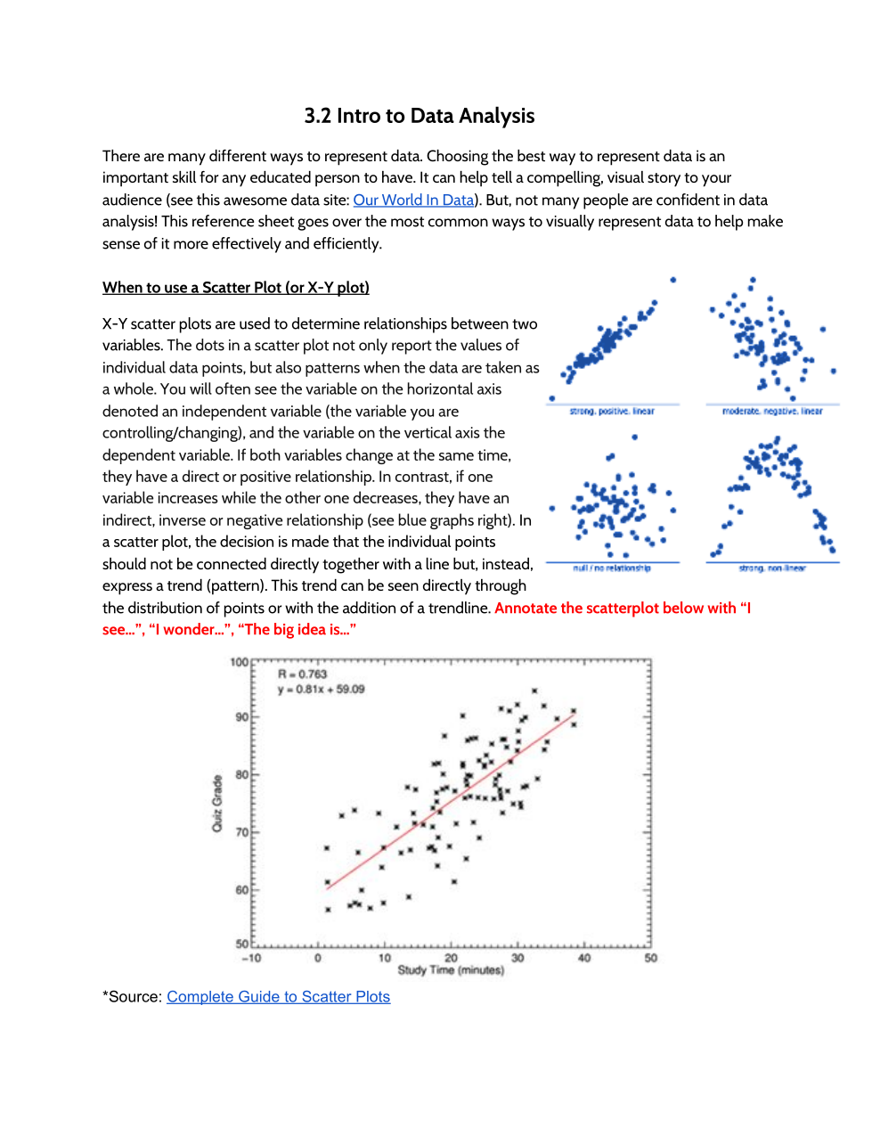
Annotate the scatterplot below with “I see…”, “I wonder…”, “The big idea is…”
Answer the following questions about the scatterplot graph.

What two things are being compared? Is there a relationship? Explain your answer using evidence from the graph.
According to the Scatterplot Graph, what prediction can you make about the quiz grade as you increase study time?
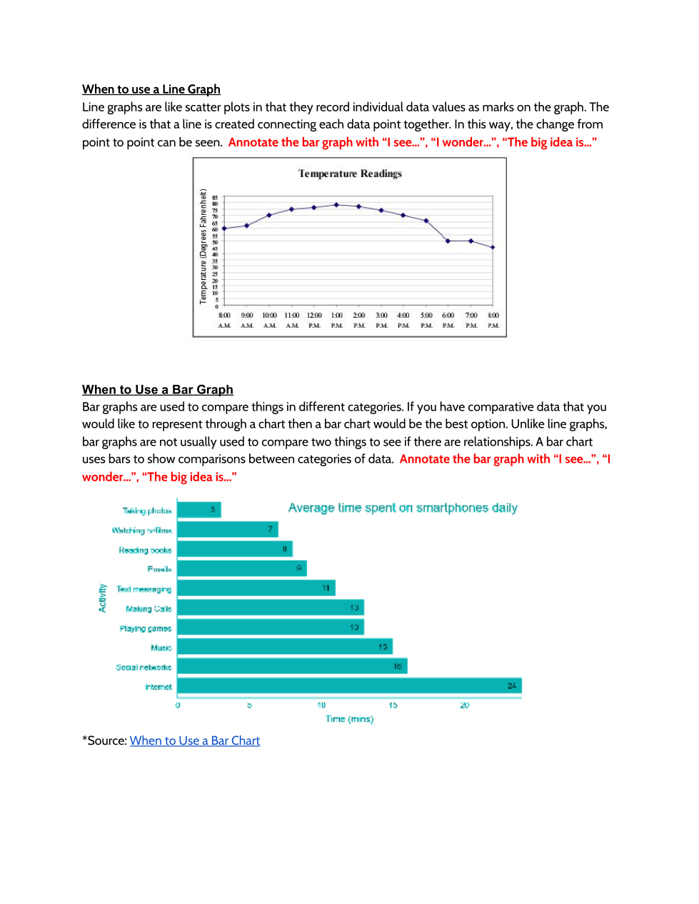
Annotate the line graph "Temperature Readings." What do you notice (“I see…”)? What do you wonder (“I wonder…”)?
What is being compared in the Temperature Readings graph?
What is one claim (conclusion) you can make from the data?
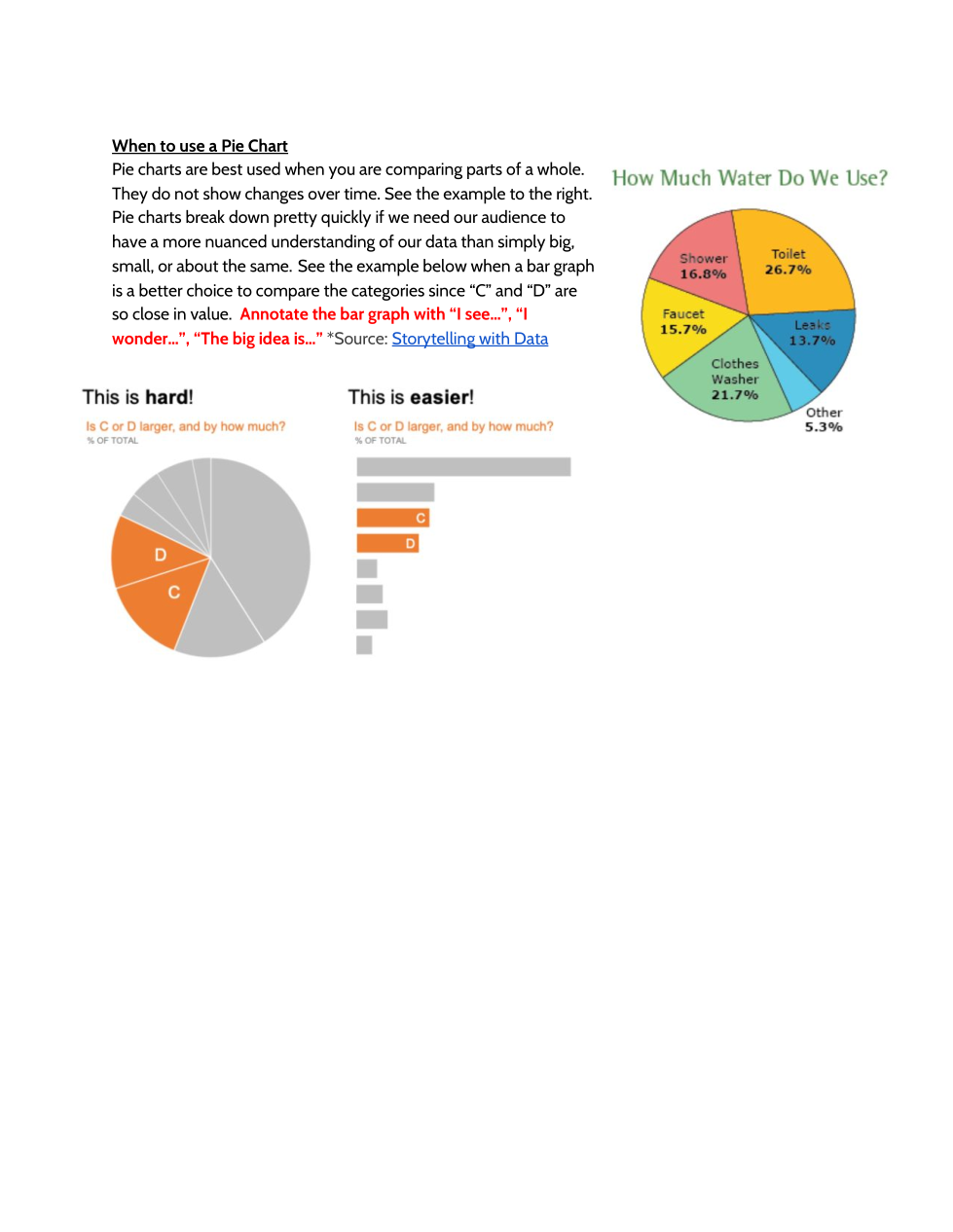
Annotate the pie graph. What do you notice (“I see…”)? What do you wonder (“I wonder…”)?
What is one claim you could make from this pie graph?
Why is it easier to interpret this data in a bar graph form rather than a pie graph?
Annotate the bar graph. What do you notice (“I see…”)? What do you wonder (“I wonder…”)?
What is being compared in the bar graph? What is one claim (conclusion) you can make from the data?