Go to this website and click "Explore the Map" on the entrance screen. The red and yellow dots represent populations of 1 million.
https://worldpopulationhistory.org/map/1/mercator/1/0/25/
1
1
1
1
1
1
1
1
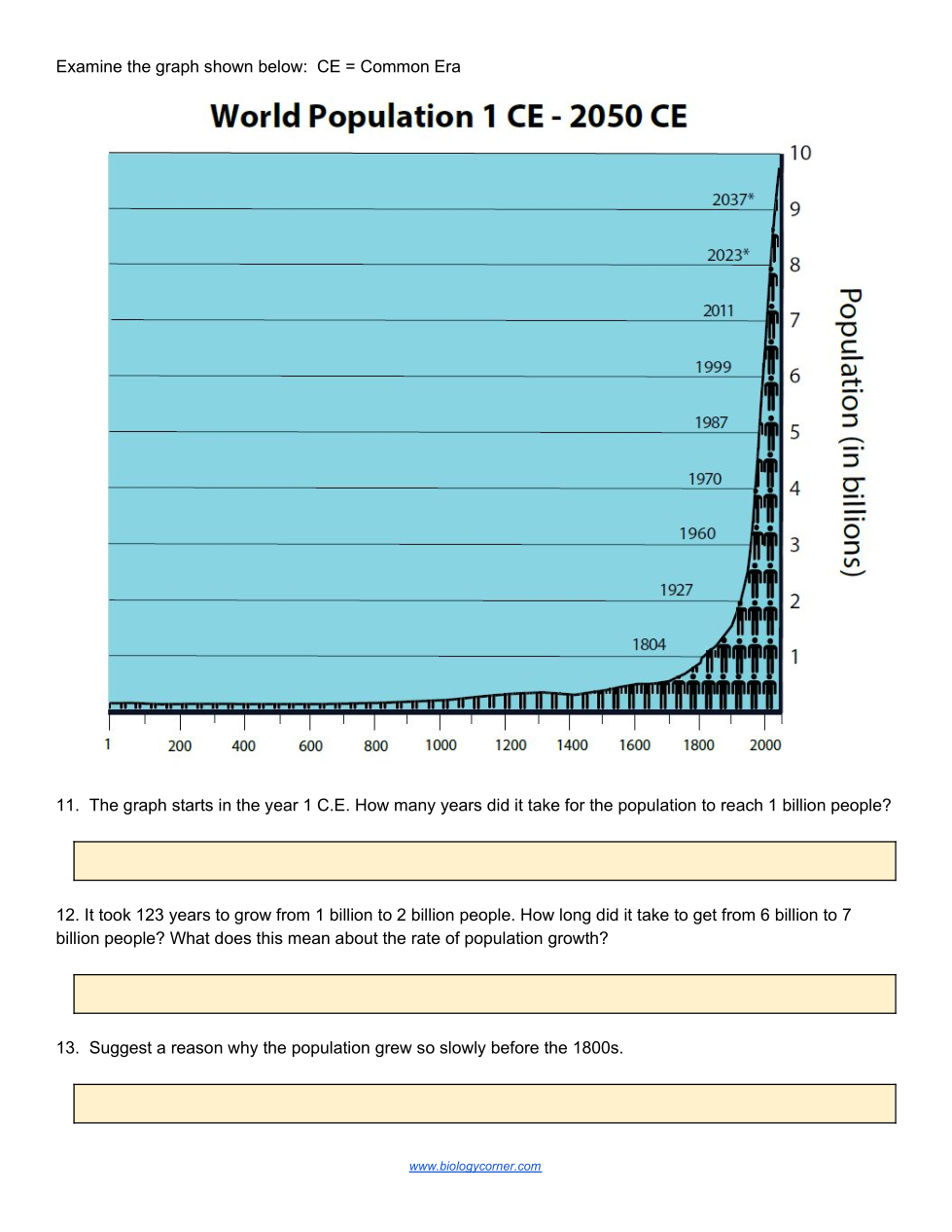
USE THE BLUE GRAPH TO THE LEFT:
A. How many years did it take for the population to reach 1 billion people?
USE THE BLUE GRAPH TO THE LEFT:
B. But then how long did it take to get from 6 to 7 billion people? (Hint: subtract)
A. This means the rate of our population growth is increasing _________.
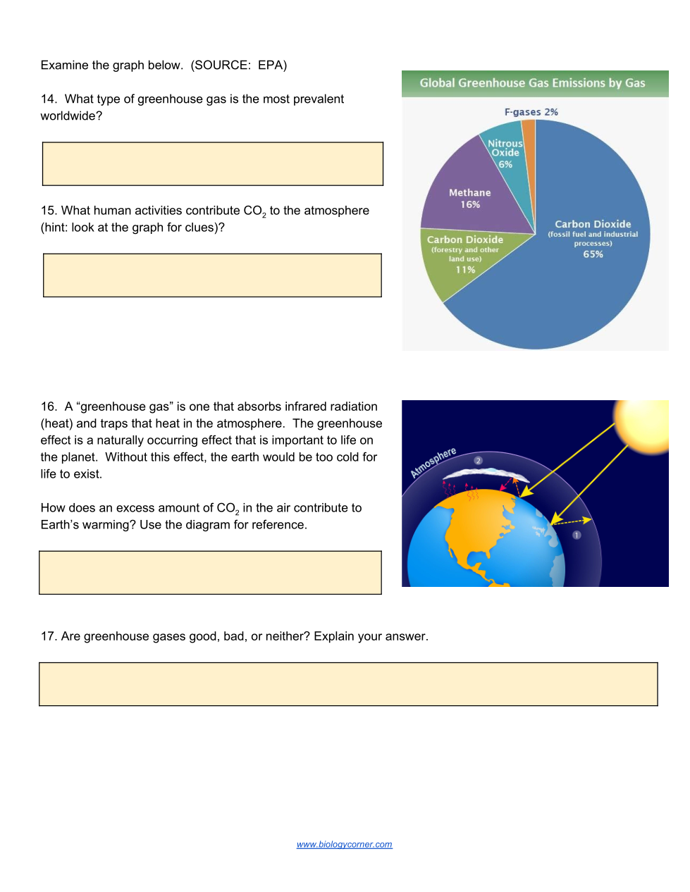
14. Look at the pie chart. What type of greenhouse gas is the most PREVALENT (most abundant) worldwide?
15. What human activities contribute CO2 to the atmosphere? (Just read the pie chart.)
16. Look at that picture of the sun reaching Earth. How does an excessive amount (too much) of CO2 in the air contribute to Earth's warming?
17. What is a GOOD thing about greenhouse gases?
(Hint: read the paragraph above)
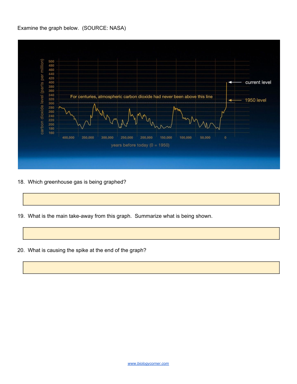
Look at the dark blue graph. Which greenhouse gas is being graphed here?
What is the main take-away from this graph. Summarize what is being shown.
(Use the word "fluctuated" meaning goes up and down a bit.)
What is causing the spike at the end (to the right) of the graph?
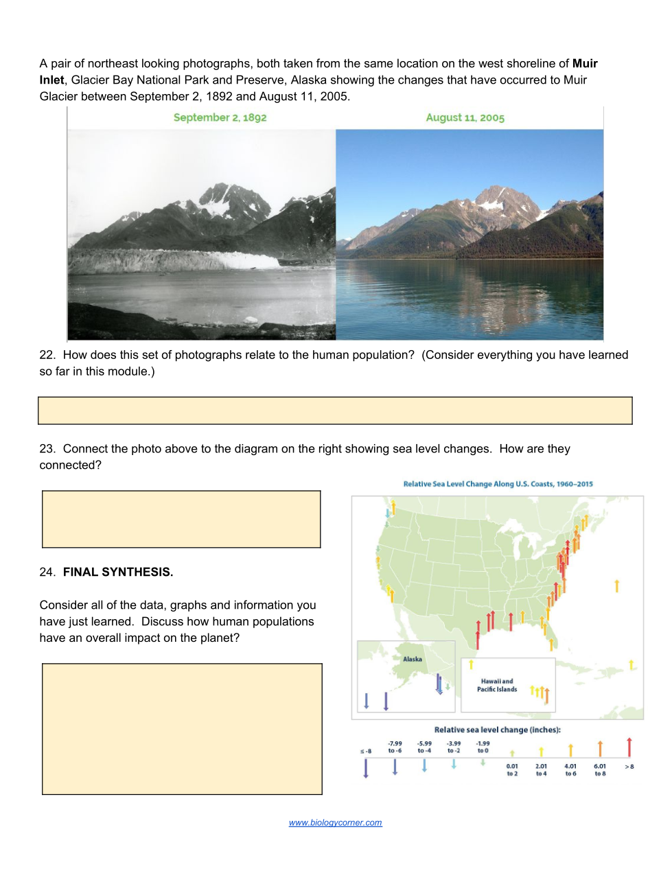
Look at the glacier before and after photographs. How do these pictures relate to the human population?
"As the population ____, the glaciers are _____ because the Earth is getting ______."
Connect the glacier photos to the diagram on the right showing sea level changes. How are they connected?
23. Consider all of the data, graphs, and info you have just learned.
Conclude how HUMAN POPULATIONS have an overall IMPACT on the planet?
Examine the colored chart at the bottom of the website. Roll over icons (left side) to see what five categories are displayed.
Besides food/agriculture, what are the other 4 categories that affect population growth?
At the year 400, what technology was invented?
How did this invention AFFECT the population growth?
NOW EXPLORE: Your choice event #1!
(Choose any other event that interests you.)
Record the name of the event, the year it occurred, and how it affected population growth.
KEEP EXPLORING: Your choice event #2!
(Choose another event that interests you.)
Record the name of the event, the year it occurred, and how it affected population growth.
EXPLORE SOME MORE: Your choice event #3!
(Choose one more event that interests you.)
Record the name of the event, the year it occurred, and how it affected population growth.
Over time, how did the number of "population" dots on the map change?
What 2 countries were the most populated in 1800?
What "people and society" event happened in 1980 that affected the population growth?
What agricultural problem occurred in 2006?
A. What year are they predicting there will be freshwater shortages?
B. And how would this affect the population growth?
Click on "OVERLAYS" at the top. Click on "Fossil Fuel CO2 Emissions". Click the PLAY button.
A. What happens to the CO2 emissions (release) between 1751 and 2010?
A. In 2000, which 2 countries had the most CO2 emissions?
(Hint: use map if you need it)

Click "OVERLAYS". Click "Fertility Rates".
A. In 1950, what was the average number of children per woman in the US at this time?
Click "OVERLAYS". Click "Fertility Rates".
B. In 2000?
C. What does this tell you about the population in the US?
B. What capital letter shape does this graph show?
Suggest a reason why the population grew so SLOWLY BEFORE THE 1800s?