Climate Time Machine
star
star
star
star
star
Last updated 4 months ago
17 Nsɛmmisa

Ɛhia
1
Ɛhia
1
Ɛhia
0
Ɛhia
1
Ɛhia
0
Ɛhia
1

Ɛhia
1

Ɛhia
1

Ɛhia
1

Ɛhia
1
Ɛhia
1
Ɛhia
1

Ɛhia
1
Ɛhia
1

Ɛhia
1

Ɛhia
1
Ɛhia
3
At the end of each summer the sea ice cover reaches its ___________extent
At the end of the summer what is left is called _______________________?
Around what year do you see a noticeable difference in the ice cover?


Above is the perennial ice cover from this past year of 2020. Was there a significant loss or gain in the ice since 1979?
Why do you think that there was a significant loss or gain in the ice cover?
Recent satellite observations have detected a thinning of parts of the Greenland ice sheet at lower elevations. A partial melting of this ice sheet would cause a 1-meter (3-foot) rise. If melted completely, the Greenland ice sheet contains enough water to raise sea level by 5-7 meters (16-23 feet).
This visualization shows the effect on coastal regions for each meter of sea level rise, up to 6 meters (19.7 feet). Land that would be covered in water is shaded red.
If the Greenland ice sheet melted completely, how high could sea levels rise potentially?
At 1 meter, where is there the most land coverage? (Red =land coverage) **Use Picture above
At 2 meters, where is there the most land coverage? (Red =land coverage) **Use Picture above
At 6 meters, there is significant land coverage in the regions around New Orleans and Miami **Use Picture Above
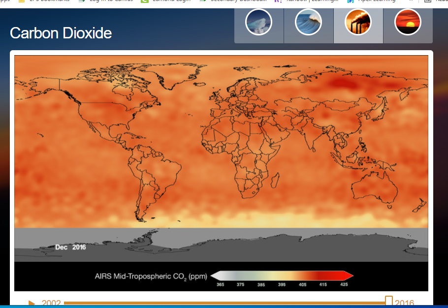
Now Click On Carbon Dioxide (3rd picture at the top)
This time series shows global changes in the concentration and distribution of carbon dioxide since 2002 at an altitude range of 1.9 to 8 miles. The yellow-to-red regions indicate higher concentrations of CO2, while blue-to-green areas indicate lower concentrations, measured in parts per million.
When does the first Orange/Red Appear on this Map?
Above is an image from Decemeber 2016. What range is the CO2 at in the United States?
What does "ppm" stand for?
Dark blue areas indicate warmer than average temperatures
Cooler than average temperatures are represented by what color on the map?
The above picture is the global temperatures in 2020. Around what temperature difference is the United States at? *Use Scale at the bottom of the picture
Where on the maps in 2020 are the temperatures impacting the most? **Use Picture Above
List below some of the reasons you think could be causing these massive changes on Earth. List at least 3!