10/20 Survivorship
star
star
star
star
star
Posljednje ažuriranje about 1 year ago
16
1
1
1
1
1
1
1
1
1
1
1
1
1
1
1
1
Introduction
Imagine a population of 1,000 individuals born at the same time in the same place. As time progresses,
some individuals die, so there are fewer and fewer individuals present each year. But when do most
individuals die? Do most individuals live to old age or do many individuals die at young ages? Ecologists
use survivorship curves to visualize how the number of individuals in a population drops off with time. In order to measure a population, ecologists identify a cohort, which is a group of individuals of the same
species, in the same population, born at the same time. Data is then collected on when each individual
in a population dies. Survivorship curves can be used to compare generations, populations, or even
different species. Survivorship curves actually describe the survivorship in a cohort: If cohorts are similar
through time, they can be considered to describe the survivorship of a population. Because survivorship
can be drastically different in different environments, this metric is not usually considered to be a
property of a species. Besides the constraint of the general life history strategy of a species, the shape of
survivorship curves can be affected by both biotic and abiotic factors, such as competition and
temperature.
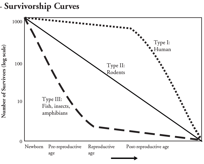
By plotting the number of survivors per 1,000 individuals on a log scale versus time, three basic patterns
emerge (Pearl 1944, Deevey 1947; Figure 1). Individuals with Type I survivorship exhibit high
survivorship throughout their life cycle. Populations with Type II survivorship have a constant proportion of individuals dying over time. Populations with Type III survivorship have very high mortality at young ages. Most real populations are some mix of these three types. For example, survivorship of juveniles fo some species is Type III, but is followed by type II survivorship for the long-lived adults.
Note that survivorship curves must be plotted on a log scale to compare with idealized Type I, II,
and III curves; they will look different on a linear scale. The use of a log scale better allows a
focus on per capita effects rather than the actual number of individuals dying. For example, the
type II curve has a constant proportion of individuals dying each time period. Starting with 1,000
individuals, in the first time period, if 40% survive, then only 400 will be left. In the second time
period, 40% of the remaining 600 will be left: 160. Plotting this on a linear scale, these three
points are not a straight line: The biggest drop occurs when 60% of the original 1,000 die in the
first time period. Nonetheless, the same proportion of individuals died both times. On a log scale,
the relationship of survivorship with time is linear; this scale highlights that the same proportion
dies in the second time period as in the first.
Hypothesis:
Procedure:
In your group of 4 students, designate one student as the bubble blower, one as the time-keeper, one as the data recorder, and one to watch a bubble (the “parent”). (The parent just watches in the first round of 10 bubbles).
In round one, the group members – including the parent – must do nothing to interfere with the bubbles.
Blow a few bubbles. The watcher immediately picks one bubble and yells “Start”. The watcher must keep her/his eye on the bubble as long as possible (sometimes a little harder outside). When the bubble pops, the watcher yells “Stop”.
The time-keeper starts keeping time, in seconds, when the watcher yells “Start” and will stop when the watcher yells “Stop”.
Record the number of seconds the bubble stayed “alive” (the time between “Start” and “Stop”.
Repeat for 10 bubbles total.
Round two. Repeat steps 1-6 but this time have the watcher, or “parent”, use his/her hands, mouth (blowing air), or paper fans to “care” for the “babies” (bubbles) and try to prevent them from coming into contact with anything that might pop them. The goal is to keep the bubble “alive” for as long as possible without popping.
Upload table 1 here.
How does the life span of an uncared for bubble compare to the life span of a cared for bubble?
How does the independent variable relate to the dependent variable?
What factor led to longer bubble life spans?
What does the x-axis on the survivorship graph represent?
Which type of organism shows a steady decline in its population at all life stages?
Which type of organism loses most of the individuals in its population at an early life stage?
What survivor type are humans?
At what life stage is type I when the number of survivors is 100?
At what life stage is type II when the number of survivors is 100?
At what life stage is type III when the number of survivors is 100?
Which of the three types have the highest number of individuals that reach reproductive age?
Through the process of evolution, all species have developed strategies to compensate for their survivorship
type. Insects lay eggs by the hundreds. Mammals keep their young close by and protected until they
reach adulthood. Factors such as these allow populations of species to survive and thrive despite their
survivorship curve.
How do you think populations with Type II or III survivorship compensate for high prereproductive
mortality?
Consider the evolutionary strategies that each survivorship type has developed for producing and
rearing their young. Propose an explanation for why type I survivors have the highest relative
number of individuals/1000 births that survive until they reach post-reproductive age?
Under what circumstances might human populations not show Type I survivorship?