What is the relative frequency for age 16?
Give your answer as a whole percentage (round up if necessary). ex. 3%
What is the relative frequency for age 17?
Give your answer as a whole percentage (round up if necessary).
Using the data from this table, draw a bar graph to display the data.
You can draw it in show your work or upload a picture of your graph into show your work.
Draw a new bar graph to more appropriately describe the data.
You can draw it in show your work or upload a picture of your graph into show your work.
(feel free to move the variables (restaurants) to the x-axis)
Draw a new bar graph to more appropriately describe the data.
You can draw it in show your work or upload a picture of your graph into show your work.
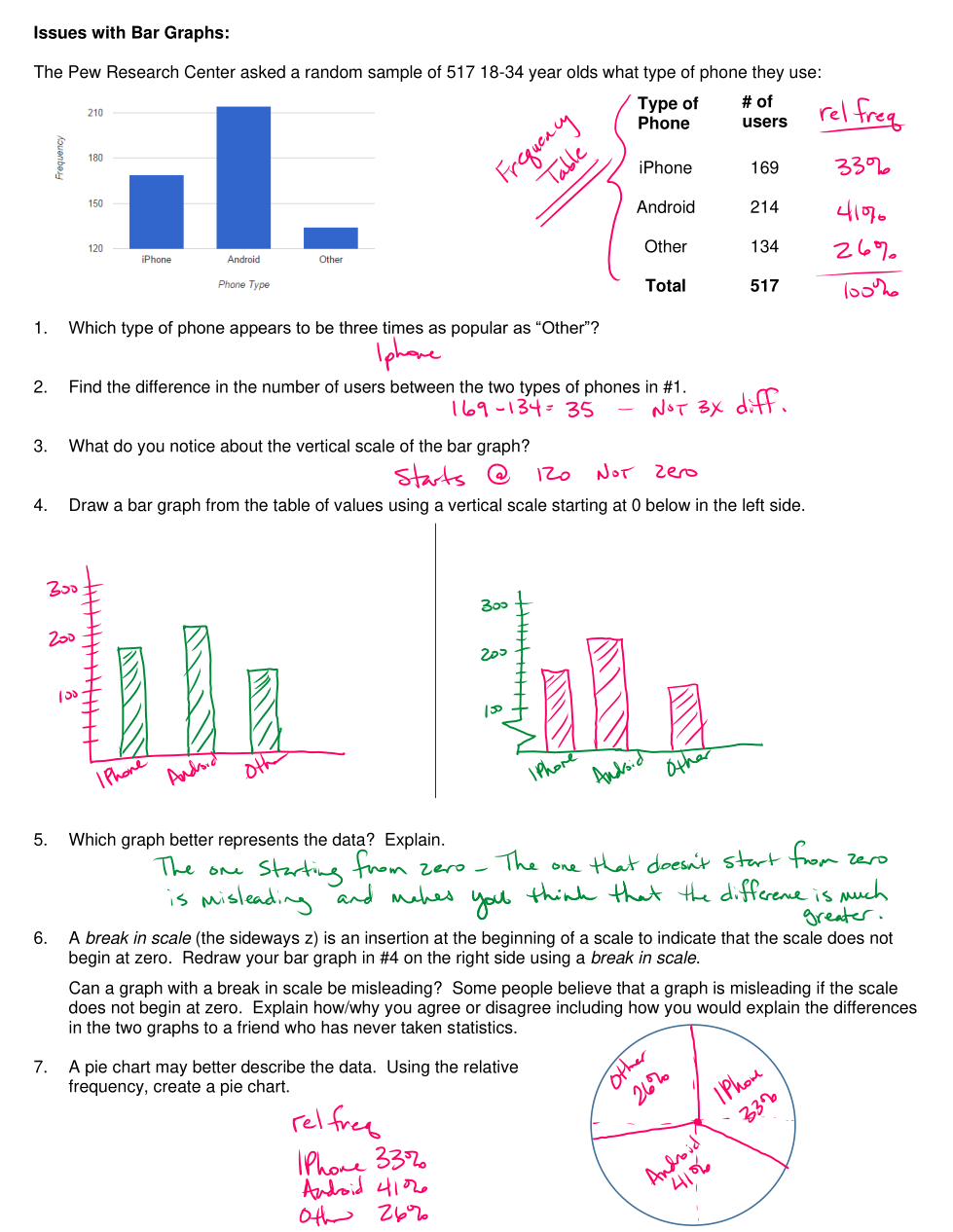
Explain why this 'bar-graph' is misleading.
Draw a new bar graph to more appropriately describe the data.
You can draw it in show your work or upload a picture of your graph into show your work.
What is the relative frequency for age 18?
Give your answer as a whole percentage (round up if necessary).
What is the relative frequency for age 19?
Give your answer as a whole percentage (round up if necessary).
The frequency table below describes the number of toy cars sold at a toy store between January and June.
What is the relative frequency of cars sold in January?
(round to the nearest tenths place and input as a percentage..ex. 25.3%)
What is the relative frequency of cars sold in February?
(round to the nearest tenths place and input as a percentage..ex. 25.3%)
What is the relative frequency of cars sold in March?
(round to the nearest tenths place and input as a percentage..ex. 25.3%)
What is the relative frequency of cars sold in April?
(round to the nearest tenths place and input as a percentage..ex. 25.3%)
What is the relative frequency of cars sold in May?
(round to the nearest tenths place and input as a percentage..ex. 25.3%)
What is the relative frequency of cars sold in June?
(round to the nearest tenths place and input as a percentage..ex. 25.3%)
Do your percentage numbers total 100%? If not, state why.


