The dot plot below shows the scores of 21 statistics students on a 20 point quiz.
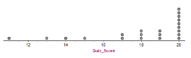
What does the dot above 14 represent?
The dot plot below shows the scores of 21 statistics students on a 20 point quiz.
What does the dot above 14 represent?
How do you know if a number is a quantitative or a categorical variable?
Give an example of a quantitative variable:
Give an example of a categorical variable:
You are thinking about purchasing a cell phone. Before making a decision, you contact the major service providers in your area to obtain some information.
For each service provider, you record the cost of the phone itself, the required length of the service contract, whether the plan includes access to the internet, and the average cost per month.
What are the individuals in this statistical study?
You are thinking about purchasing a cell phone. Before making a decision, you contact the major service providers in your area to obtain some information.
For each service provider, you record the cost of the phone itself, the required length of the service contract, whether the plan includes access to the internet, and the average cost per month.
What are the variables in this statistical study?
You are thinking about purchasing a cell phone. Before making a decision, you contact the major service providers in your area to obtain some information.
For each service provider, you record the cost of the phone itself, the required length of the service contract, whether the plan includes access to the internet (yes or no), and the average cost per month.
What are the quantitative variables in this statistical study?
What does relative frequency mean?
Use this information for #9 - A sample of students at the local high school was recently asked to identify their favorite subject area.
Here are their responses:
Math Math Social Studies Math Math Science
English Math Math Math Math Science
Science English Social Studies English Math Math
Math Math Social Studies English Science Math
Math Science Social Studies English Math Social Studies
Is 'favorite class' a categorical or quantitative variable?
Create a frequency table on scratch paper to record the frequency of each response.
Use: www.statsmedic.com/applets to enter the data and categories.
Select analysis and a Frequency/Relative Frequency table will be shown.
Copy and paste it below in the 'show your work' area.
Keep the website and data displays open.
Now use the same data analysis from #9.
Create a bar chart with relative frequency on the vertical axis.
Copy and paste it in the 'show your work' below.
What does the bar chart from #11 show?
Would it be appropriate to display the data for students' favorite class (from #9) in a pie chart?
The dot plot below shows the scores of 21 statistics students on a 20 point quiz.
What does the dot above 14 represent?
Using the dot plot above, what percent of the students scored less than 19?
Round your answer to the nearest tenth (one place past the decimal) and include the units (%).
Describe the shape of the distribution shown in #13.
Describe the range (variability) of the distribution in #13.
Describe the center of the distribution in #13:
Does there appear to be an outlier in the dotplot shown in #13? Explain.
When strawberries are thawed there is a tendancy to lose some juice in the process. A recent study was done to try to reduce the amount of juice lost during thawing. The data below gives the percentage of juice lost after thawing for 12 different strawberry varieties from a recent experiment.
2.8, 4.1, 4.1, 4.2, 4.4, 4.4, 4.6, 4.8, 5.0, 5.0, 5.3, 5.6
Use statsmedic.com/applets to construct a SPLIT stemplot.
Copy and paste it into the 'show your work' section below. Enlarge the picture to almost fill the rectangle area.
Make sure to include all the necessary parts for the stemplot.
Why would we split the stems in a stemplot?
Using the key from the stemplot above, what does 3|2 mean?
What are the four words we use to describe a data distribution?
Below are the responses to a survey asking students what their favorite flavors of ice cream are:
vanilla, chocolate, vanilla, vanilla, mint chocolate chip, strawberry, vanilla, mint chocolate chip, cookies and cream, cookies and cream, chocolate, vanilla, vanilla, mint chocolate chip
What graphs/charts could be used to display the data?
Below are the responses to a survey asking students how many screens they have at their home:
5, 3, 8, 5, 11, 4, 14, 6, 5, 7, 10, 15, 4, 8, 10, 5, 7, 6, 5
What graphs/charts could be used to display the data?
Below is a stacked histogram showing the distribution of exam scores from two different Statistics classes.
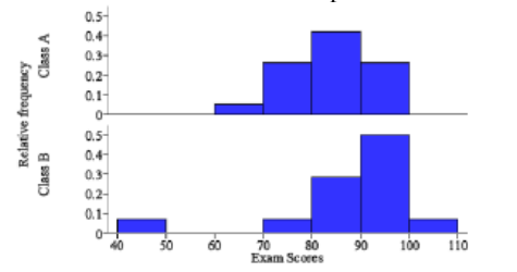
Hint: If you'd like, relative frequency can be expressed as a decimal. Multiply by 100 to get the %.
Compare the histograms from the two classes: