Twa kɔ nsɛm atitiriw so
Log in
Sign up for FREE
arrow_back
Laabri

SPA 1.1 & 1.2 Content Check

star
star
star
star
star
Last updated over 2 years ago
13 Nsɛmmisa
Hyɛ no nsow a efi ɔkyerɛwfo no hɔ:

Use your notes to work the practice problems, then enter the answers to check your answer.

Use your notes to work the practice problems, then enter the answers to check your answer.

Ɛhia
1
Ɛhia
1
Ɛhia
1
Ɛhia
1
Ɛhia
2
Ɛhia
1
Ɛhia
1
Ɛhia
2
Ɛhia
1
Ɛhia
2
Ɛhia
1
Ɛhia
3
Ɛhia
3
Asemmisa {{asɛmmisaAhyɛnsode}}
1.

Section 1.1

Box Office Smash According to the Internet Movie Database, Avatar is tops based on box-office receipts worldwide. The table displays data on several movies.
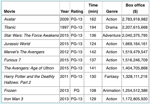
Identify the individuals in this data set.
Asemmisa {{asɛmmisaAhyɛnsode}}
2.

Section 1.1

Box Office Smash According to the Internet Movie Database, Avatar is tops based on box-office receipts worldwide. The table displays data on several movies.

Identify the variables in this data set.

Asemmisa {{asɛmmisaAhyɛnsode}}
3.

Section 1.1

Box Office Smash According to the Internet Movie Database, Avatar is tops based on box-office receipts worldwide. The table displays data on several movies.

Which variables are categorical?

Asemmisa {{asɛmmisaAhyɛnsode}}
4.

Section 1.1

Box Office Smash According to the Internet Movie Database, Avatar is tops based on box-office receipts worldwide. The table displays data on several movies.

Which variables are quantitative?

Asemmisa {{asɛmmisaAhyɛnsode}}
5.

Section 1.2

Use: statsmedic.com/applets

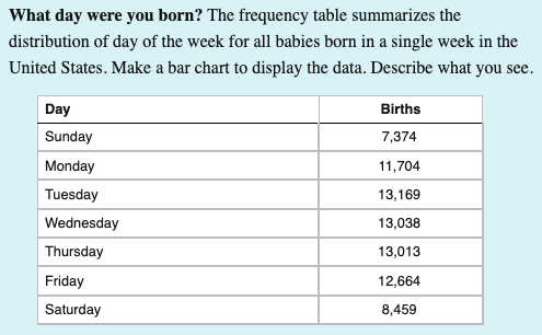
Variable: Day of the Week Births

Enter the names of the days of the week & their counts. Select 'analyze'. Select 'bar graph'.

Copy and paste the bar chart and put it in the 'show your work' section using the picture icon.

Also create a pie chart, copy and paste it next to the bar chart.

Asemmisa {{asɛmmisaAhyɛnsode}}
6.

1.2 Using the bar and pie charts you created for #5, describe what you see or notice about the different days on which babies are born.

Asemmisa {{asɛmmisaAhyɛnsode}}
7.

1.1 Using the information from #5, what is/are the individuals in the study?

Asemmisa {{asɛmmisaAhyɛnsode}}
8.

1.1 Using the information from #5, what is/are the variables that were recorded in the study?

Asemmisa {{asɛmmisaAhyɛnsode}}
9.

1.2

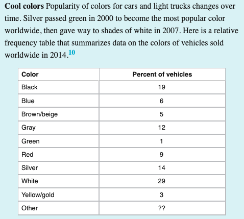
Using the Relative Frequency table above, what percent of the cars had an 'other' color?

Asemmisa {{asɛmmisaAhyɛnsode}}
10.

1.2 Using the frequency chart in #9, would it be appropriate to show the data in a pie chart? Why or why not?

Asemmisa {{asɛmmisaAhyɛnsode}}
11.

1.2

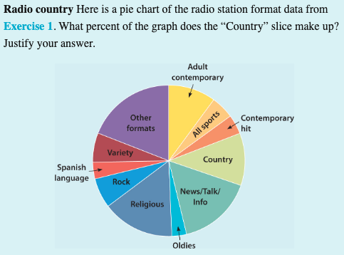
Estimate the % that 'Country' makes up in the pie chart above.

Asemmisa {{asɛmmisaAhyɛnsode}}
12.

1.2

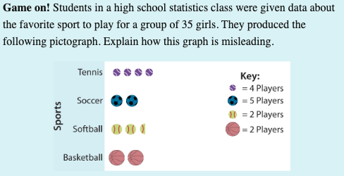
How is the graph above misleading? Please explain.

Asemmisa {{asɛmmisaAhyɛnsode}}
13.

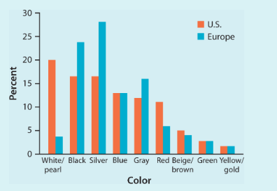
Favorite vehicle colors may differ among countries. The bar chart displays data on the most popular car colors in a recent year for the United States and Europe.

Write a few sentences comparing the distributions.

Select the statements that are true.