Twa kɔ nsɛm atitiriw so
Log in
Sign up for FREE
arrow_back
Laabri

2.1 - 2.4 Content Check

star
star
star
star
star
Last updated about 2 years ago
16 Nsɛmmisa
Ɛhia
6
Ɛhia
1
Ɛhia
1
Ɛhia
4
Ɛhia
1
Ɛhia
1
Ɛhia
4
Ɛhia
2
Ɛhia
3
Ɛhia
2
Ɛhia
2
Ɛhia
1
Ɛhia
1
Ɛhia
1
Ɛhia
1
Ɛhia
3
Asemmisa {{asɛmmisaAhyɛnsode}}
1.

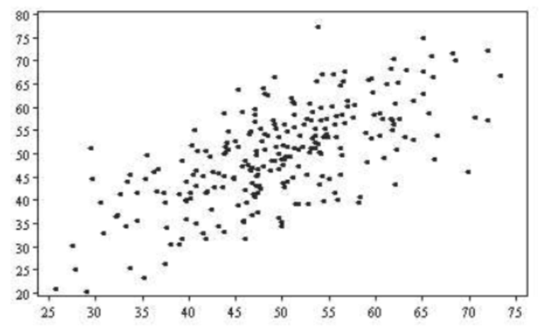
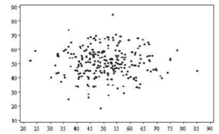
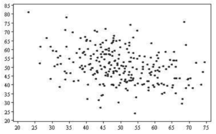
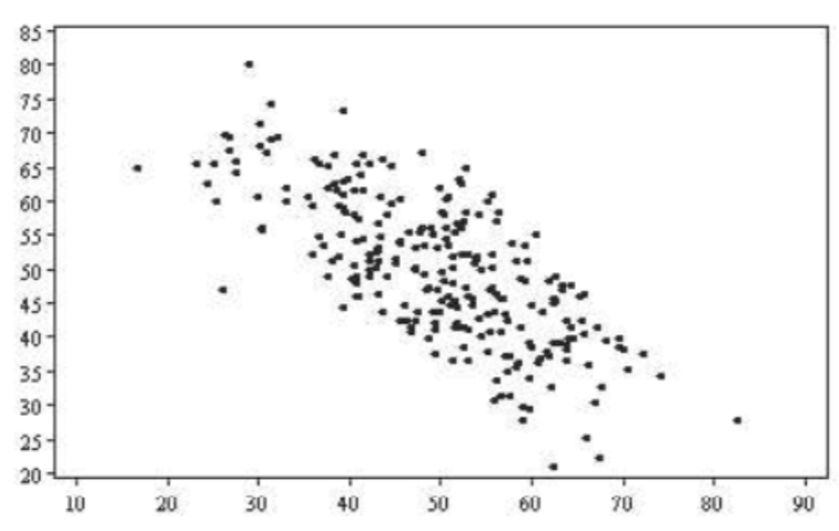
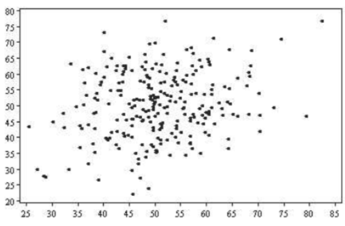
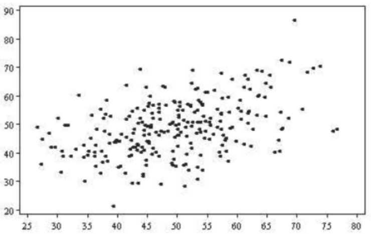
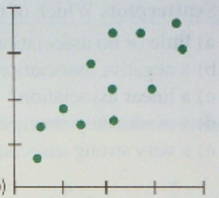
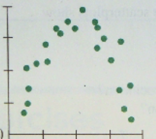
Match the correlation coefficients with the corresponding graphs:

Draggable itemarrow_right_altCorresponding Item

0.01

arrow_right_alt

-0.67

arrow_right_alt

-0.73

arrow_right_alt

0.45

arrow_right_alt

0.67

arrow_right_alt

0.22

arrow_right_alt

Asemmisa {{asɛmmisaAhyɛnsode}}
2.

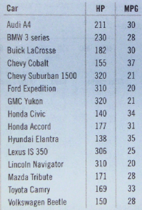
Here are advertised horsepower ratings and expected gas mileage for several 2010 vehicles.

In this situation, what is the Explanatory Variable?

And, what is the response variable?

Match the answers below.

Draggable itemarrow_right_altCorresponding Item

Car Model

arrow_right_alt

Explanatory Variable

HP

arrow_right_alt

Response Variable

MPG

arrow_right_alt

Individuals in the Sample

Asemmisa {{asɛmmisaAhyɛnsode}}
3.

Using the data from #2:

  1. Make a scatterplot for these data, use statsmedic.com/applets, (2 quantitative variables) take a snip and insert it in the 'show your work' area.

2. Describe the direction, form, and strength of the plot.

Asemmisa {{asɛmmisaAhyɛnsode}}
4.

Using the data and information from #3:

Does it make sense to calculate the correlation coefficient? Why?

Asemmisa {{asɛmmisaAhyɛnsode}}
5.

Use statsmedic.com/applets. Have statsmedic calculate the correlation coefficient.

Enter it below: r=

Asemmisa {{asɛmmisaAhyɛnsode}}
6.

Interpret the correlation between engine strength and fuel economy. Use our notes from 2.3.

I will grade this answer.

Asemmisa {{asɛmmisaAhyɛnsode}}
7.

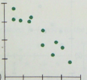
Match the correlation coefficient values with the corresponding scatterplots.

Draggable itemarrow_right_altCorresponding Item

-0.923

arrow_right_alt

0.777

arrow_right_alt

0.006

arrow_right_alt

-0.487

arrow_right_alt

Asemmisa {{asɛmmisaAhyɛnsode}}
8.

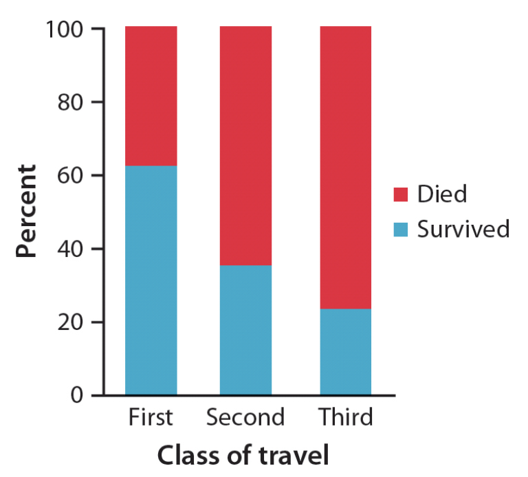
Data from the Titanic was used to look at survival of this terrible accident. The chart below shows a comparison of two variables:

What are the two variables that are being compared?

Asemmisa {{asɛmmisaAhyɛnsode}}
9.

Data from the Titanic was used to look at survival of this terrible accident. The chart below shows a comparison of two variables:

Is there an association between the variables?

How can you tell?

If so, explain the association. Find three answers.

Asemmisa {{asɛmmisaAhyɛnsode}}
10.

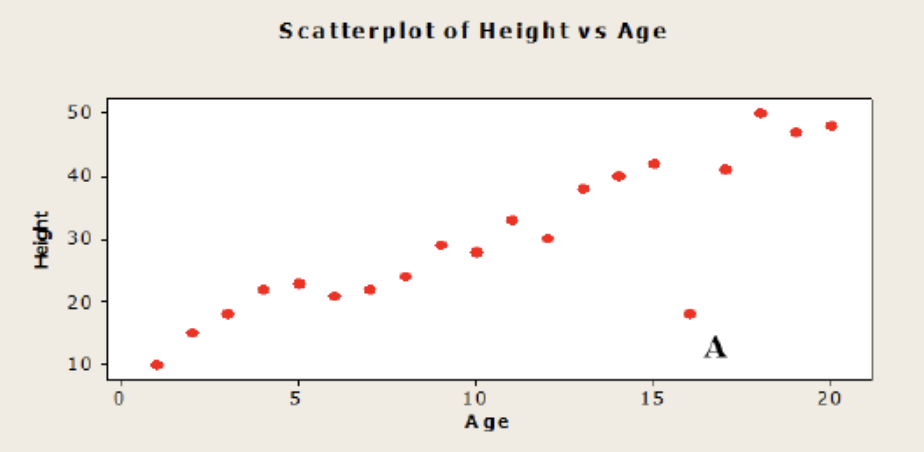
Biologists have collected data relating the age (in years) of one variety of oak tree to its height (in feet). A scatterplot for 20 of these trees is given below.

How does point A affect the correlation of the relationship? Explain.

Select both answers.

Asemmisa {{asɛmmisaAhyɛnsode}}
11.

Biologists have collected data relating the age (in years) of one variety of oak tree to its height (in feet). A scatterplot for 20 of these trees is given below.

Describe the relationship between Age and Height. Make sure to describe all four aspects from Lesson 2.2.

Asemmisa {{asɛmmisaAhyɛnsode}}
12.

Using the information from #10 & 11, interpret the correlation of r= 0.895 for the relationship between the age of trees and their height.

Asemmisa {{asɛmmisaAhyɛnsode}}
13.

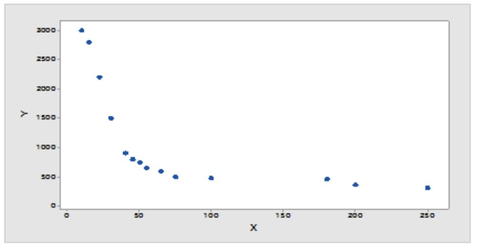
Describe the relationship shown in the scatterplot below.

Make sure to describe all four aspects from Lesson 2.2.

Asemmisa {{asɛmmisaAhyɛnsode}}
14.

The correlation between the number of dogs kept as pets in the U.S. and money spent on tennis balls is r = 0.93. Does the strong correlation between these two variables suggest that having more dogs kept as pets causes people to spend more money on tennis balls?

Explain in complete sentences.

Asemmisa {{asɛmmisaAhyɛnsode}}
15.

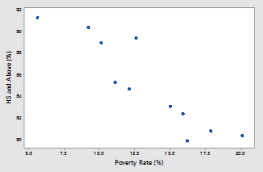
Eleven states were randomly selected from among the 50 United States.

The scatterplot below shows the relationship between the percentage of households in each state that are below the poverty level (Poverty Rate) based on household income and the percentage of adults in the state who had earned at least a high school degree (HS and Above).

What would happen to the correlation if the HS and Above (%) was plotted on the horizontal axis and the poverty rate (%) was plotted on the vertical axis?

Asemmisa {{asɛmmisaAhyɛnsode}}
16.

The gas mileage of an automobile first increases and then decreases as the speed increases. Suppose that this relationship is very regular, as shown by the following data on speed (miles per hour) and mileage (miles per gallon).

Use statsmedic.com/applets to create a scatterplot of the data.

Calculate the correlation coefficient (r)=

Explain why the correlation coefficient has this value even though there is a strong relationship between speed and mileage.

Select three answers.