The scatter plot shows the NCAA Quarterback statistics for the number of passes attempted to the number of passes completed. Answer the questions as true or false. IF it is false tell me why.
Ex: (false) (475 is too high or too low)
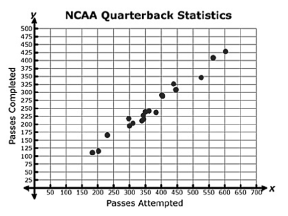
Passes Attempted is the x axis.
Passes Completed is the x axis.
The data on shows a positive linear correlation.
The data shows a negative linear correlation.
325 passes where attempted if 475 passes where completed.
375 passes where attempted if 475 passes where completed.
600 passes where attempted if 475 passes where completed.
675 passes where attempted if 475 passes where completed.
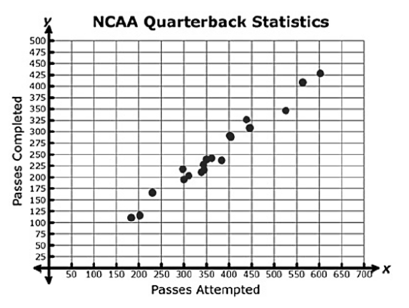
Based on the scatter plot, what is the best prediction of the number of passes attempted is 475 passes were completed?
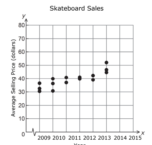
Cool Skates made a scatterplot to show the relationship between the year and the average
selling price of a skateboard.
Based on the scatterplot, what is a reasonable expected average selling price of a skateboard
in 2016?
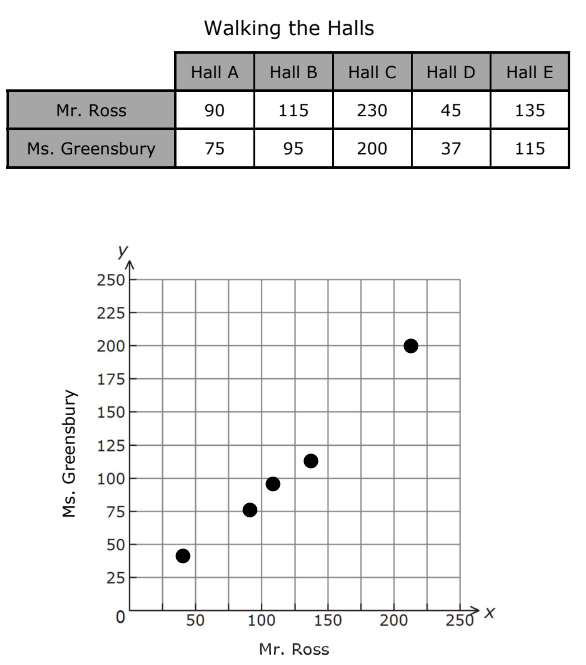
The table shows the number of steps it takes Mr. Ross and Ms. Greensbury to walk the length
of different hallways in the school building.
What is the best description of the relationship between Mr. Ross’ steps and Ms. Greensbury’s
steps?
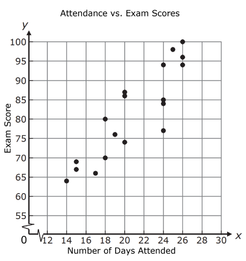
Ms. Suárez made a scatterplot to show the relationship between the number of days a student
attended her class during the first six weeks and the student’s exam score.
Based on this scatterplot, approximately what score should a student who attended class
22 days expect to receive on the exam?
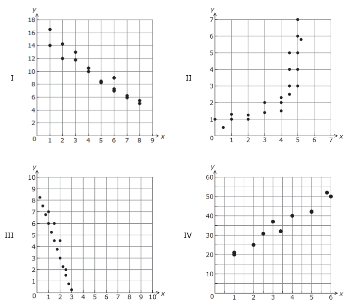
Which scatterplot suggests a negative linear relationship between x and y?