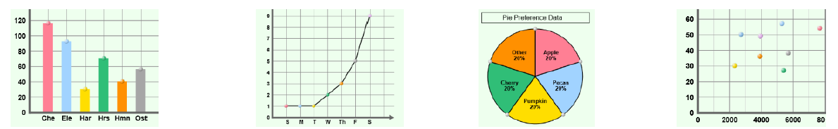
Look at the graphs below. Click on the bar graph.
Look at the graphs below. Click on the bar graph.
bar graph, line graph, negative relationship, pie chart, positive relationship, scale, scatter plot, variable, x-axis, y-axis, independent variable, and the dependent variable
Use the vocabulary sheet and your class notes to complete the question below.
What is a bar graph?
Look at the graphs below. Click on the bar graph.
What is a line graph?
Look at the graphs below. Click on the line graph.
What is a pie chart?
Look at the graphs below. Click on the pie chart below.
What is a scatter plot?
Look at the graphs below. Click on the scatter plot.
Match the word with the correct definition
| Stavka koja se može prevući | arrow_right_alt | Odgovarajuća stavka |
|---|---|---|
scale | arrow_right_alt | A relationship between two variables. As one variable increases, the other variable tends to decrease.
|
variable | arrow_right_alt | A relationship between two variables. As one variable increases, the other variable also tends to increase.
|
positive relationship | arrow_right_alt | the amount represented by each unit on an axis. |
negative relationship | arrow_right_alt | a value that can change. |
Match the word with the correct definition
| Stavka koja se može prevući | arrow_right_alt | Odgovarajuća stavka |
|---|---|---|
y-axis | arrow_right_alt | variable that you are testing or that you change |
independent variable | arrow_right_alt | measurement of the independent variable; changes because of how the indepent variable changes |
dependent variable | arrow_right_alt | the horizontal axis that is used to graph the independent variable |
x-axis | arrow_right_alt | the vertical axis that is used to graph the dependent variable |
Watch the video below to learn how to set up a graph by writing in the title and the labels for the dependent and independent variables.
https://screenpal.com/v/c31oqQV3CTY
The Graphing Skills Gizmo starts with a bar graph on the right and a data set on the left.
All graphs include the following information:
A title describing the information presented in the graph
A label for the horizontal axis (x-axis.)
A label for the vertical axis (y-axis.)
Numbers on at least one axis.
1. Change the graph type to "bar graph" and click "new" until you see the title "Life Expectancy Data."
2. Click "Show Values" on the graph.
3. Write the graph title in the space at the top of the graph. The graph title is the same as the title of the table.
4. Write the name of the independent variable in the box at the bottom of the graph (x-axis.) The independent variable is the title of the first column in the table.
5. Write the name of the dependent variable (y-axis) in the vertical box on the left side of the graph - don't forget to include the unit of measurement in parenthesis. The dependent variable is the name of the second column of the table.
6. Change the scale, so the number at the top is 100 by clicking on the scale arrows.
7. On the Bar Graph, drag the top of the bar up until you reach the correct number.
Which country has the best life expectancy?
Which country has the worst life expectancy?
A bar graph is useful for comparing things, such as how fast animals can run. Select the data table "Animal Speed Data."
1. Make sure the graph type is set to "bar graph" and click "new" until you see the title "Animal Speed Data."
2. Click "Show Values" on the graph.
3. Write the graph title in the space at the top of the graph. The graph title is the same as the title of the table.
4. Write the name of the independent variable in the box at the bottom of the graph (x-axis.) The independent variable is the title of the first column in the table.
5. Write the name of the dependent variable (y-axis) in the vertical box on the left side of the graph - don't forget to include the unit of measurement in parenthesis. The dependent variable is the name of the second column of the table.
6. Change the scale, so the number at the top is 200 by clicking on the scale arrows.
7. On the Bar Graph, drag the top of the bar up until you reach the correct number.
Watch the video below for help.
https://screenpal.com/v/c31oqpV3CvO
What vertical scale did you choose?
(In other words, how much does each horizontal line on the graph represent? Another way to think about this is, what are the lines skip counting by? 5's, 10's, 20's??) This graph has a scale of 5 because the y-axis is skip-counting by 5.
What did your vertical scale skip count by?
Watch the video below for help.
https://screenpal.com/v/c31oq8V3Cx9
Look at the bar graph. Which animal was the slowest?
Look at the bar graph. Which animal was the fastest?
A bar graph is useful for comparing things, such as how how many baseball cards a group of students own.
1. Make sure the graph type is set to "bar graph" and click "new" until you see the title "Baseball Card Data."
2. Click "Show Values" on the graph.
3. Write the graph title in the space at the top of the graph. The graph title is the same as the title of the table.
4. Write the name of the independent variable in the box at the bottom of the graph (x-axis.) The independent variable is the title of the first column in the table.
5. Write the name of the dependent variable (y-axis) in the vertical box on the left side of the graph - don't forget to include the unit of measurement in parenthesis. The dependent variable is the name of the second column of the table.
6. Change the scale, so the number at the top is 100 by clicking on the scale arrows.
7. On the Bar Graph, drag the top of the bar up until you reach the correct number.
Click on the part(s) of the graph that are not correct.
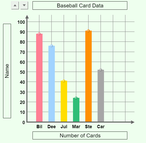
Who had the most baseball cards?
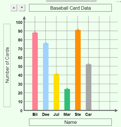
Who had the fewest baseball cards?
Line graphs show a dependent relationship where one of the variables depends on the other variable. For example, in the data table, the temperature outside depends on the day of the week.
1. Change the graph type to "line graph."
2. Click "New" until you see the data table for "Temperature Data."
3. Click "Show Values" on the graph.
4. Write the graph title in the space at the top of the graph. The graph title is the same as the title of the table.
5. Write the name of the independent variable in the box at the bottom of the graph (x-axis.) The independent variable is the title of the first column in the table.
6. Write the name of the dependent variable (y-axis) in the vertical box on the left side of the graph - don't forget to include the unit of measurement in parenthesis. The dependent variable is the name of the second column of the table.
7. Change the scale, so the number at the top is 100 by clicking on the scale arrows.
8. On the LINE GRAPH, drag the dots near the bottom up OR down to represent the number in the data table.
Look at the line graphs below. They are the graph of the same data. What has changed on each graph?

Which graph at first glance looks like there was a huge change in temperature over the course of the week?
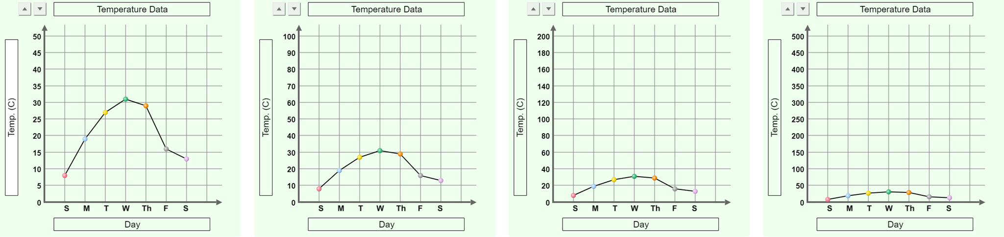
Which graph at first glance looks like there was a small change in temperature over the course of the week?
As the scale increases on a line graph...
Change the graph type to "pie chart" and type in the graph title. Pie charts are graphs representing data as percentages. You will create a pie chart showing the preferences for a type of pie (forgive the pun!)
1. Click "New" and select "Pie Preference Data."
2. Click "Show Values" on the graph.
3. Write the name of the pie chart in the title bar at the top of the pie chart. The pie chart title is the same as the data table title.
4. On the Pie chart, change each slice's size by dragging the edges.
What is the favorite type of pie?
What is the least favorite type of pie?
1. Click "New" and select "Candy Color Data."
2. Click "Show Values" on the graph.
3. Write the name of the pie chart in the title bar at the top of the pie chart. The pie chart title is the same as the data table title.
4. On the Pie chart, change each slice's size by dragging the edges.
What is the most common color of candy?
What is the least most common color of candy?
Watch the help video BEFORE creating the scatter plot.
https://screenpal.com/v/c31orTV3Cmp
Scatter plots are used to see if one variable is related to another. Each point on a scatter plot has two values that represent the independent variable and the dependent variable. You are graphing an ORDERED PAIR. The first number is graphed on the x-axis, and the second is graphed on the y-axis.
For example, Anchorage is 61 degrees latitude north and has a temperature of 2 C. You would graph the ordered pair (41, 2) on the graph. The first number in the ordered pair is the independent variable - latitude. This is graphed on the x-axis (horizontal). The second number is the dependent variable - temperature. Temperature is graphed on the y-axis (vertical).
1. Change the graph type to "Scatter plot."
2. Click "New" until you see the data table for "Temp and Latitude Data."
3. Click "Show Values" on the graph.
4. Write the graph title in the space at the top of the graph. The graph title is the same as the title of the table.
5. Write the name of the independent variable in the box at the bottom of the graph (x-axis.) The independent variable is the title of the SECOND column in the table.
6. Write the name of the dependent variable (y-axis) in the vertical box on the left side of the graph - don't forget to include the unit of measurement in parenthesis. The dependent variable is the name of the THIRD column of the table.
7. Change the scale, so the number at the top is 50 by clicking on the scale arrows.
8. On the Scatter Plot, grab the dot next to the row on the table and drag it onto the graph. Once you bring the dot onto the graph, you will see a set of parenthesis with the student name and the ordered pair you are graphing.)
Interpreting the scatter plot.
Look at the scatter plot in the workspace.
Draw a line through the dots that runs through the middle of the dots. This is called the "line of best fit." You are trying to make a "line" that represents the trend of the data. Try to get the same number of dots above the line as you have below the line.
What information does the line you drew provide?
Based on the line you drew, as latitude increases (going further north), the temperature decreases (gets colder). This is an example of a relationship. Look at your vocabulary sheet for the answer.
Scatter plots are used to see if one variable is related to another. Each point on a scatter plot has two values that represent the independent variable and the dependent variable. You are graphing an ORDERED PAIR. The first number is graphed on the x-axis, and the second is graphed on the y-axis.
1. Change the graph type to "Scatter plot."
2. Click "New" until you see the data table for "Studying and Score Data."
3. Click "Show Values" on the graph.
4. Write the graph title in the space at the top of the graph. The graph title is the same as the title of the table.
5. Write the name of the independent variable in the box at the bottom of the graph (x-axis.) The independent variable is the title of the SECOND column in the table.
6. Write the name of the dependent variable (y-axis) in the vertical box on the left side of the graph - don't forget to include the unit of measurement in parenthesis. The dependent variable is the name of the THIRD column of the table.
7. Change the vertical scale so the number at the top is 100 by clicking on the scale arrows.
8. Change the horizontal scale so the number is 50 by clicking on the scale arrows.
8. On the Scatter Plot, grab the dot next to the row on the table and drag it onto the graph. Once you bring the dot onto the graph, you will see a set of parenthesis with the student name and the ordered pair you are graphing.)
Draw the line of best fit for the scatter plot. What is the relationship between the amount of time a student spends studying and their test score?
Which student does not fit the trend that the more time you study the better your test score?


