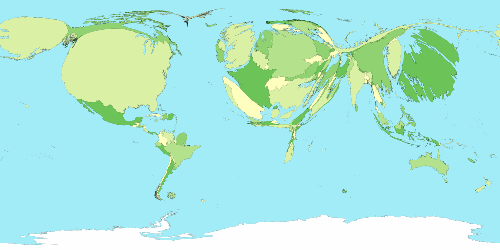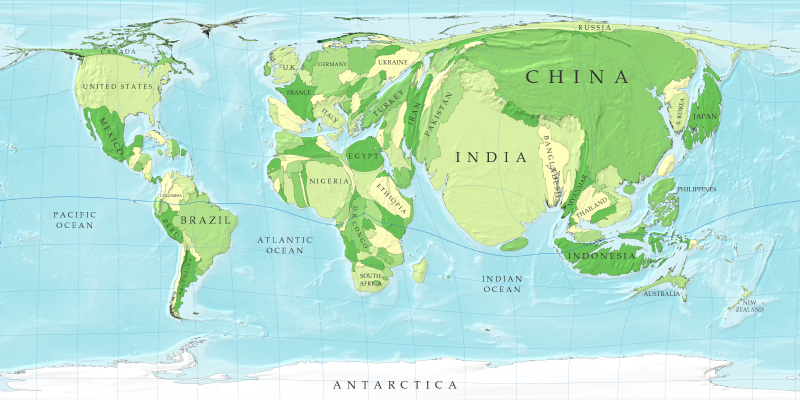
It's possible, however, and very useful, to redraw the map with the sizes of countries made bigger or smaller in order to represent something of interest. Such maps are called cartograms and are an effective way to portray data.
To the left, for example, is a cartogram that shows the human population of the countries of the world. In this map, the sizes of countries are not proportional to their actual landmass, but instead to the number of people living there. For example, a country with 20 million people appears twice as large as a country with 10 million.
Cartograms can be useful visual representations of all kinds of data...