Graphing lines lesson!

Last updated over 2 years ago
17 questions
Our objective: We will use a data set to create a line graph

Standards: Science and Engineering Practices: Construct and interpret graphical displays of data to identify linear and nonlinear relationships
MS-PS3-1: Construct and interpret graphical displays of data to describe the relationships of kinetic energy to the mass of an object and to the speed of an object.
1

What types of graphs have you made before?

The 5 things that every scientific line graph needs:


1) A title
The title should describe what the graph is about. If you are graphing the height of a tree every month for a year, your title could be "Tree height every month for a year." If you are doing an experiment where you have a variable (something you're testing) and measurement of that change, you can follow this format "How (variable) affects (measurement)".

For example, if you're testing how much fertilizer is best for growing tall plants, you could have a title of "How the amount of fertilizer affects plant height."

2) Labeled axes
The axes are the bold lines at the side and bottom of the graph. On the horizontal (x) axis, we put either time (if your graphing something over the course of time) or the independent variable (amount of fertilizer).

On the y axis is where we graph the measurements. On a distance/time graph, the y axis is distance because it's a measurement of how far you travelled. On the fertilizer graph, it's height.

3) Numbered axes
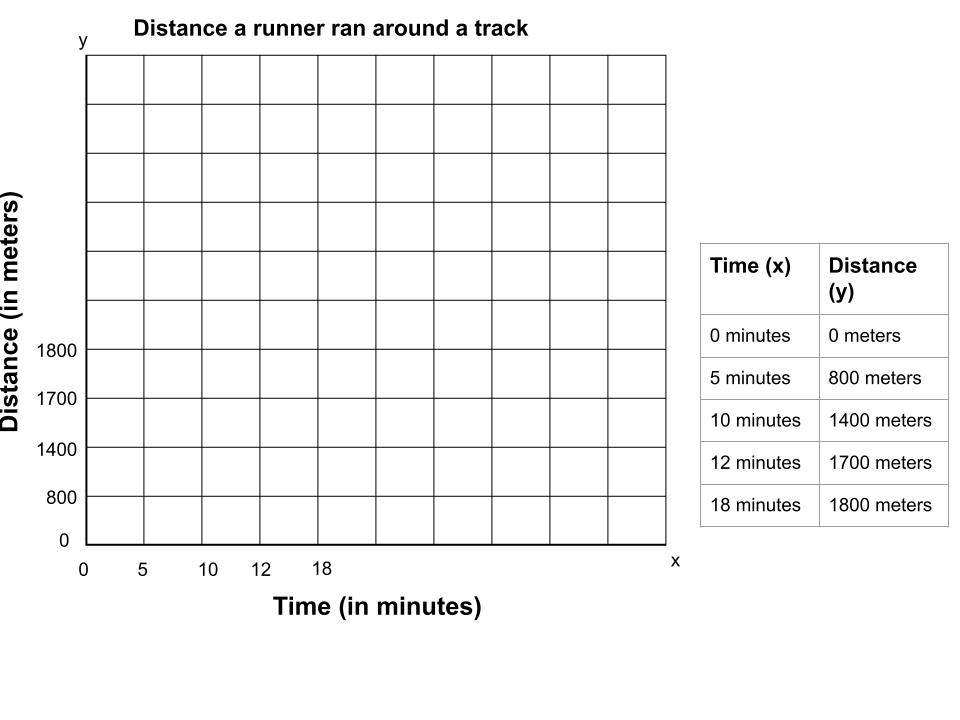
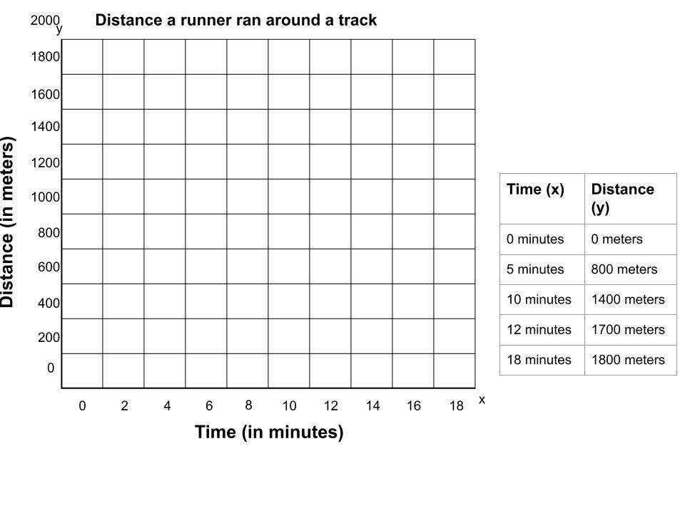
To help people read our graphs, we need to make sure we add numbers to the different lines on the axes. These numbers need to be even and contain all your data. To do this, count how many lines split up your axis. Look at your largest number in your data. Divide that number by the number of lines. This should give you an idea of what number you need to count by on the axis.

For example, imagine the y-axis of your graph is separated into 10 lines. if you have measured the height of a tree and the biggest number is 45 feet, you can divide 45 by ten to see what number you should count by. The answer is 4.5, but since that number is hard to count by, you can use any number larger than 4.5. I would choose 5 as a counting number.

4) Plot the points
Once your graph is set up, you can begin plotting your data points.

5) All the dots connected in a line
Connect the dots. When you are done plotting your points, make sure to connect the dots with straight lines in order from left to right. It might look like a lot of spikes but that's ok.

Use this empty graph and data table to answer the following questions about graph titles and axes titles

Titling the graph and axes


Remember, the graph needs a title that helps explain what data it is representing. It helps tell a story about what happened when the scientist was collecting data. We put time on the x axis when graphing motion. We put the testing variable on the x axis when testing a hypothesis in the lab. The y axis is for the dependent variable - the measurements we take that we are not in control of.
1

What is the title of this graph?

1

What is the title of the x-axis?

1

What is the title of the y-axis?

1

What types of data are in the data table?

1

What do you think this graph is about?

Numbering the axis


Remember, we need to add numbers for the lines on the axis. We should choose a numbering pattern that matches our data and allows all the data to fit on the graph. We could count by 1s, 2s, 5s 7s, 140s, 1 millions, etc, so long as it matches our data!
1

How many lines are on each axis? Don't include the axis itself

1

What is the largest number that will need to go on the x axis?

1

If we count by 1s (each line increases by 1), will we have enough room on the x axis to fit all of our data?

1

What would be an appropriate size interval between the lines on the x axis? (What number should we count by in order to fit all the data?)

1

What is the largest number that will need to go on the y axis?

1

If we count by 1000s (each line increases by 1), will we have enough room on the y axis to fit all of our data?

1

What would be an appropriate size interval between the lines on the y axis? (What number should we count by in order to fit all the data?)

1

What is incorrect about this graph?

1

This graph is set up incorrectly. What is the error?

1

Step 4: Plot the points!

1

Step 5: Connect the points with a line from left to right.