Would you rather give up showering for a month or give up the internet for a month? _______
Would you rather get the hiccups every other hour or have to end every sentence you speak with “I do declare”?_______
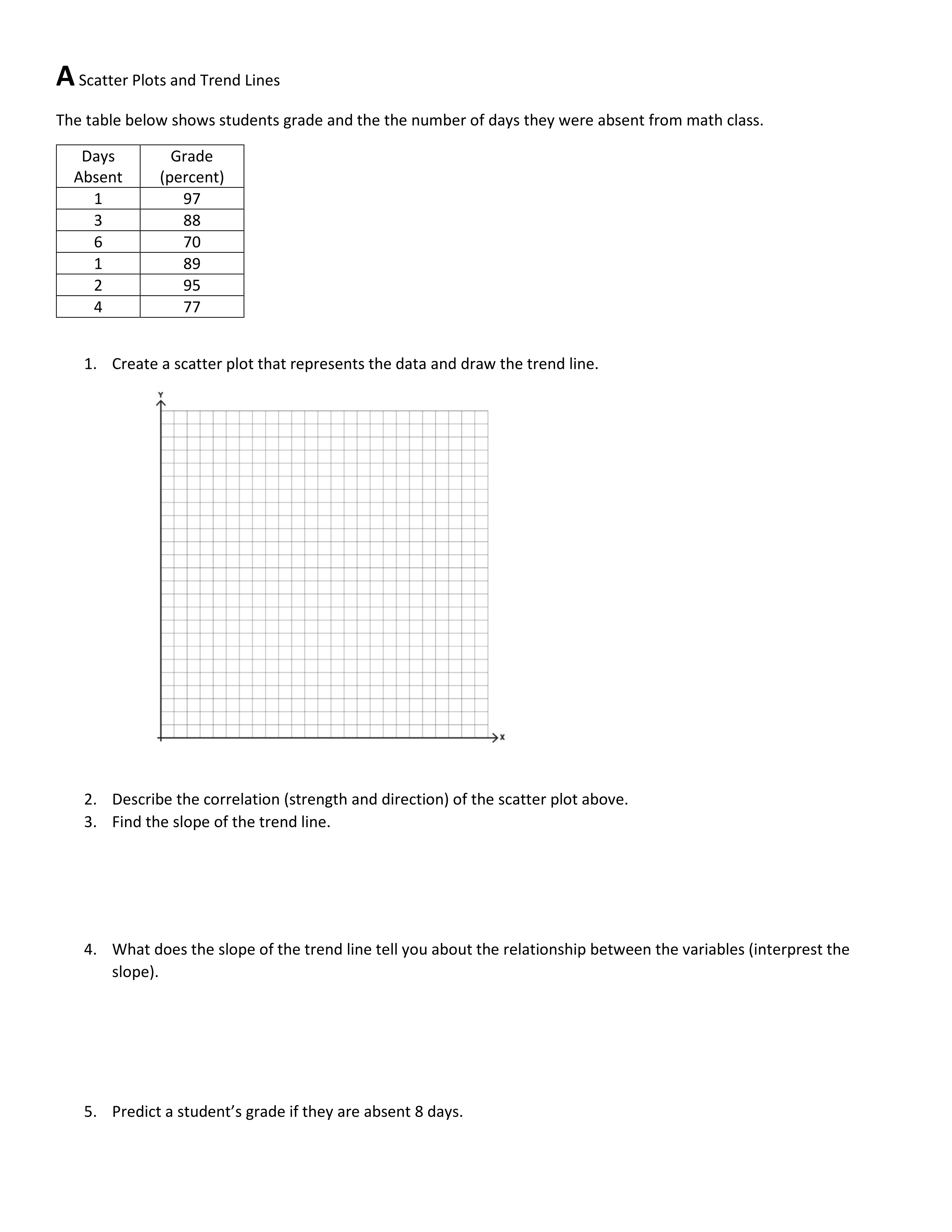
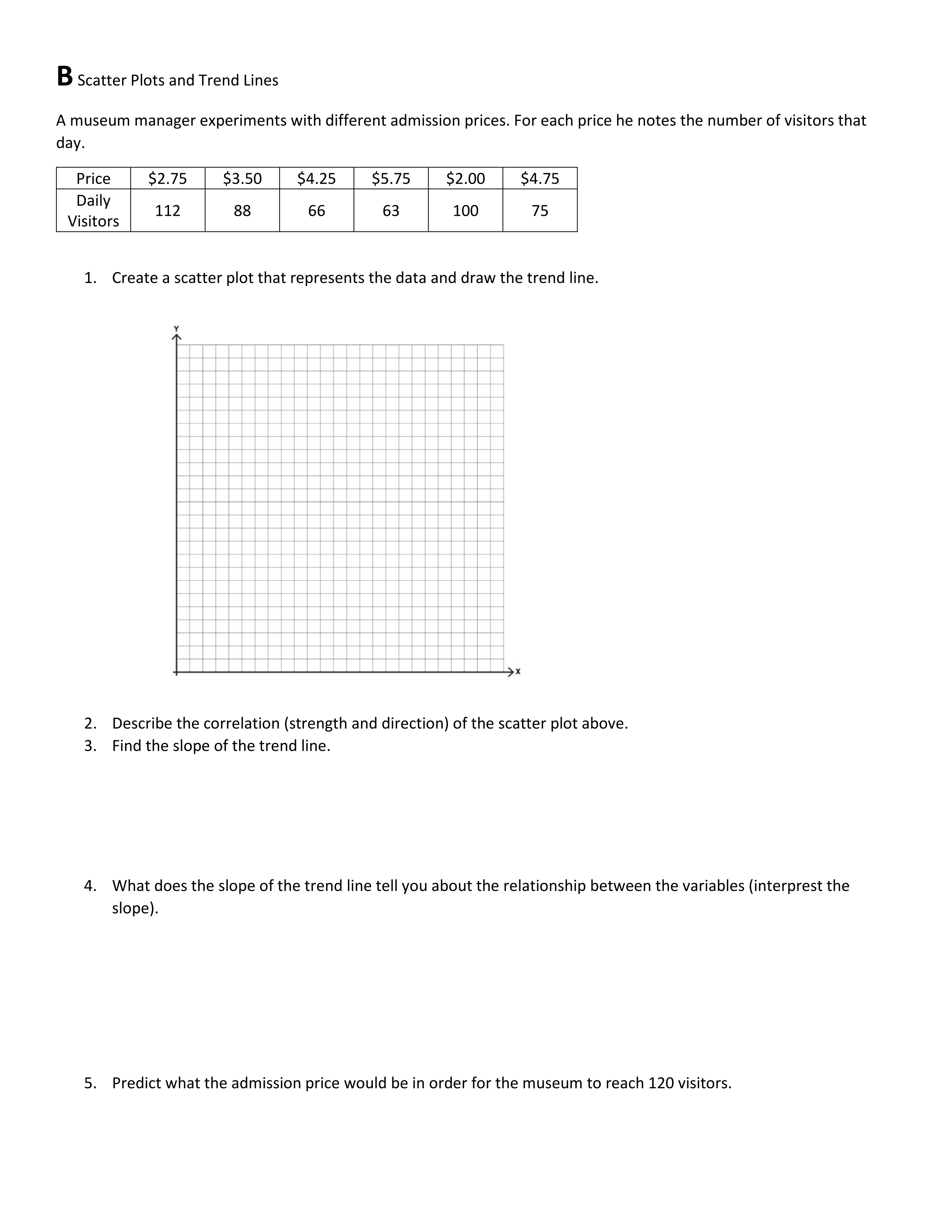
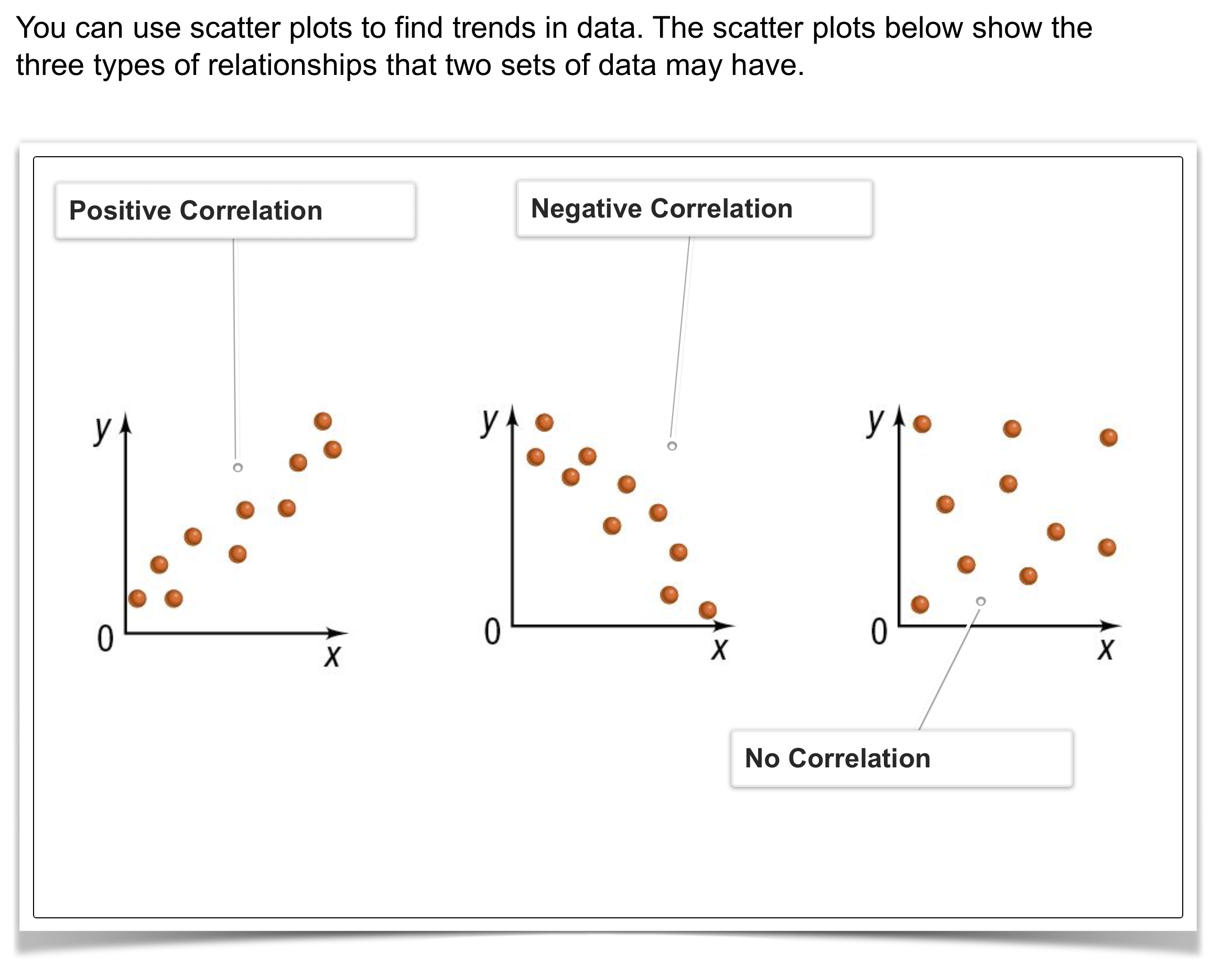
Scatter Plots: Review
10 points
10
Question 2
2.
Solve It! The table shows the number of digital albums downloaded per year and the number of CDs sold by manufacturers per year. What relationship exists between the two sets of data? In other words, as the number of downloads increases, is there a predictable change in the other?
You may use Desmos Graphing Calculator to answer the questions.
10 points
10
Question 3
3.
Solve It! Predict the number of CDs sold and the number of albums downloaded in 2010. Explain your reasoning.
10 points
10
Question 4
4.
Using Desmos Calculator, make a scatter plot of the data in the table.
Find the equation for the line of best fit: _______
What is the correlation coefficient (r): _______
10 points
10
Question 5
5.
Problem 1 Got It? What type of relationship does the scatter plot you created in the previous item show?
1 point
1
Question 6
6.
What does it mean if the correlation coefficient (r) of a data set is close to 1? You may use the canvas to help illustrate your written response.
1 point
1
Question 7
7.
What does it mean if the correlation coefficient of a data set is close to 0?
Scatter Plot: Round 1
30 points
30
Question 8
8.
Make a scatter plot of the data.
Draw an appropriate trend line,
Write an equation of the trend line.
Be sure to include relevant graph detail: label axes, indicate units and scale on both axes, and use arrows to represent end behavior, as appropriate.
10 points
10
Question 9
9.
Consider your scatter plot and the data in the previous item. What type of relationship is shown?
10 points
10
Question 10
10.
Consider your scatter plot and the data once more. Predict the average maximum daily temperature in January at a latitude of 50° N.
Choose the most reasonable prediction.
Scatter Plot: Round 2
1 point
1
Question 11
11.
Create a scatter plot that represents the data and draw the trend line.
YOU CAN CREATE ON DESMOS AND NOT HERE.
1 point
1
Question 12
12.
Describe the correlation (strength and direction) of the scatter plot above.
1 point
1
Question 13
13.
Find the slope of the trend line. Show your work below.
1 point
1
Question 14
14.
What does the slope of the trend line tell you about the relationship between the variables (interpret the slope)?
1 point
1
Question 15
15.
Predict a student's grade if they are absent 8 days.
Scatter Plot: Round 3
1 point
1
Question 16
16.
Create a scatter plot that represents the data and draw the trend line.
(you may copy and paste from Desmos)
1 point
1
Question 17
17.
Describe the correlation (strength and direction) of the scatter plot above.
1 point
1
Question 18
18.
Find the slope of the trend line. Show your work below.
1 point
1
Question 19
19.
What does the slope of the trend line tell you about the relationship between the variables (interpret the slope).
1 point
1
Question 20
20.
Predict what the admission price would be in order for the museum to reach 120 visitors.