Module 3 Topic 2 Assessment Form A (white)
star
star
star
star
star
Posljednje ažuriranje over 2 years ago
15
1
1
3
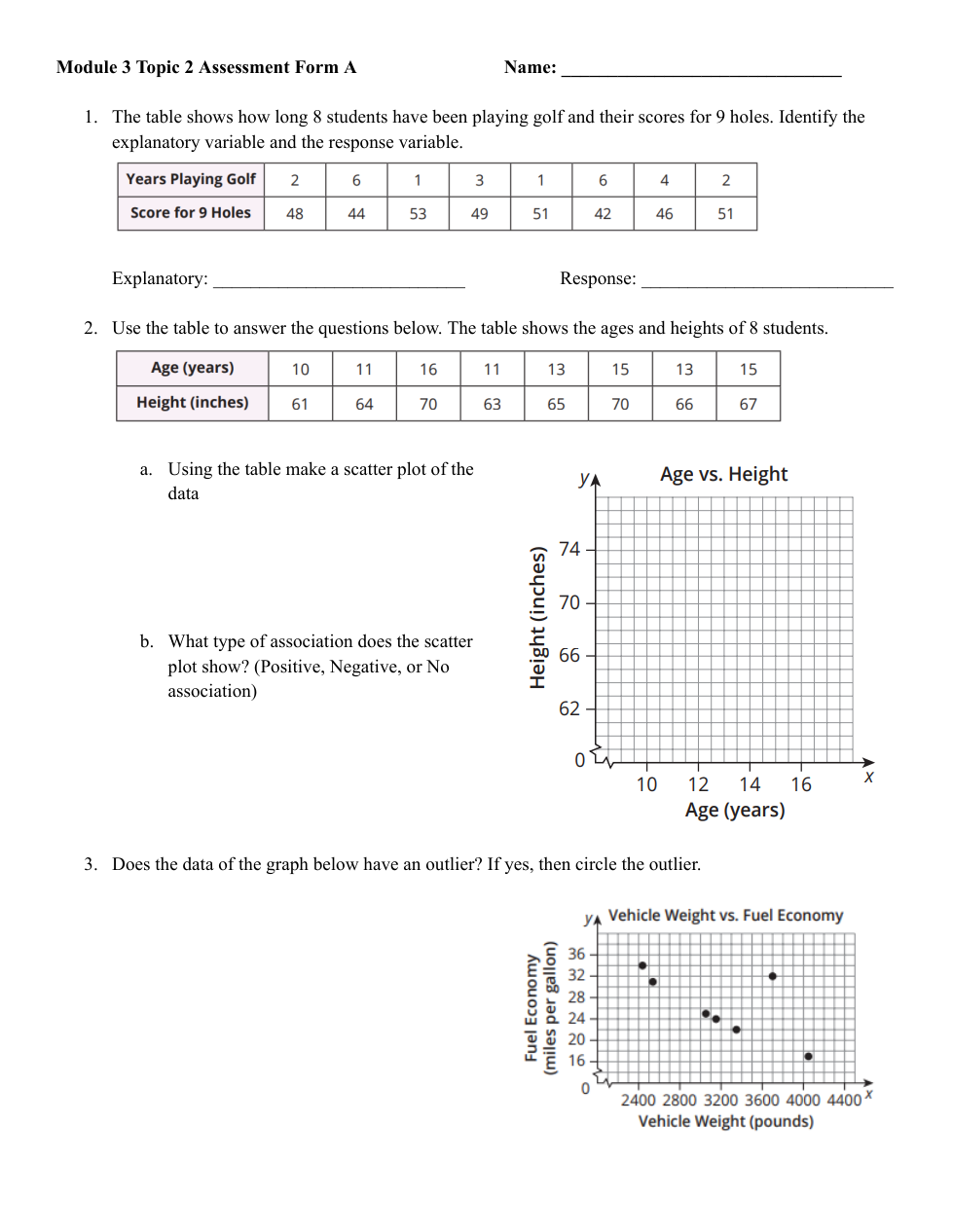
The Table shows how long 8 students have been playing golf and their scores for 9 holes. Identify the explanatory variable and the response variable.
Explanatory:
Response:
2a. Using the table make a scatter plot of the data.
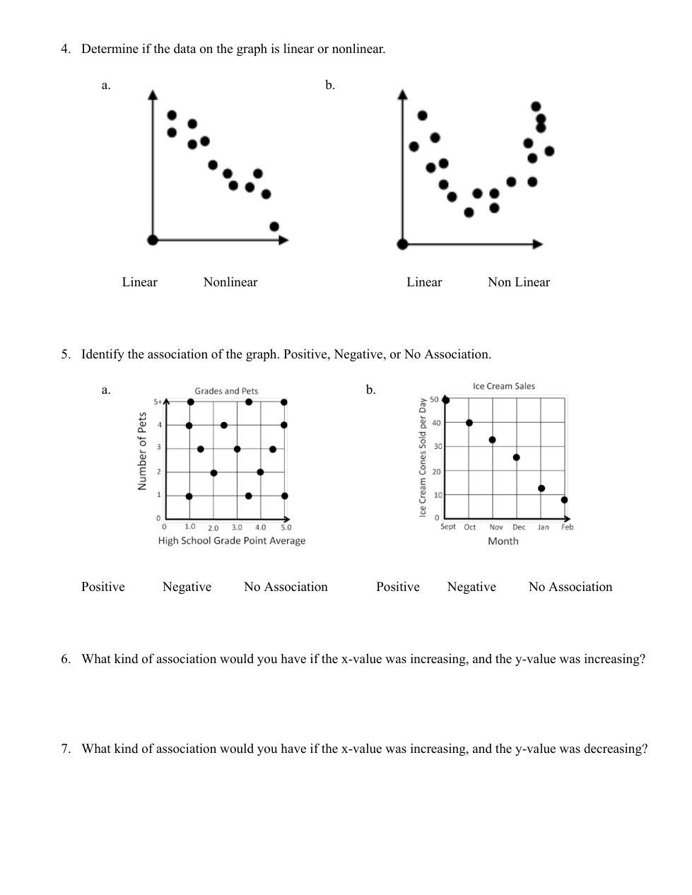
4a. Determine if the data on the graph is linear or non linear.

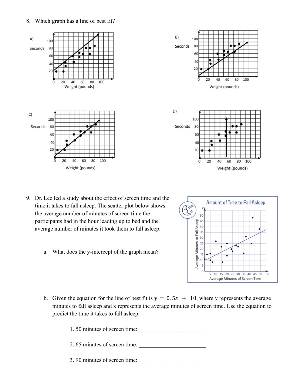
8. Which graph has a line of best fit?
9a. What does the y- intercept of the graph mean?
9b. Given the equation for the line of best fit is y=0.5x + 10, where y represents the average minutes to fall asleep and x represents the average minutes of screen time. Use the equation to predict the time it takes to fall asleep.
1. 50 minutes of screen time:
2. 65 minutes of screen time:
3. 90 minutes of screen time:

The scatter plot shows the number of visitors to a museum and how many visitors ate at the museum restaurant each day during one week.
What is the meaning of point (75, 58)
Billy wants to know if he is improving his skill on the cello. He created a scatter plot and drew a line of best fit.

If he uses the points (2,8) and (5,1.5) from his line, which equation would best represent his line of best fit?
2B. What type of association does the scatter plot show?
Does the Data of the graph below have and outlier? If yes then circle the outlier.
4b. Determine if the data on the graph is linear or non linear.

5a. Identify the association of the graph.

5b. Identify the association of the graph.

6. What kind of association would you have if the x-value was increasing, and the y-value was increasing?
7. What kind of association would you have if the x-value was increasing, and the y value was decreasing?