Module 3 Topic 2 Assessment Form B (Pink)
star
star
star
star
star
Last updated over 2 years ago
15 Nsɛmmisa
1
1
1
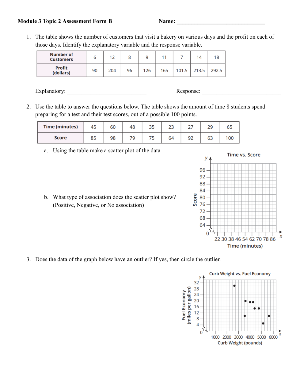
The table shows the number of customers that visit a bakery on various days and the profit on each of these days. Identify the explanatory variable and the response variable.
Explanatory:
Response:
2a. Using the table make a scatter plot of the data
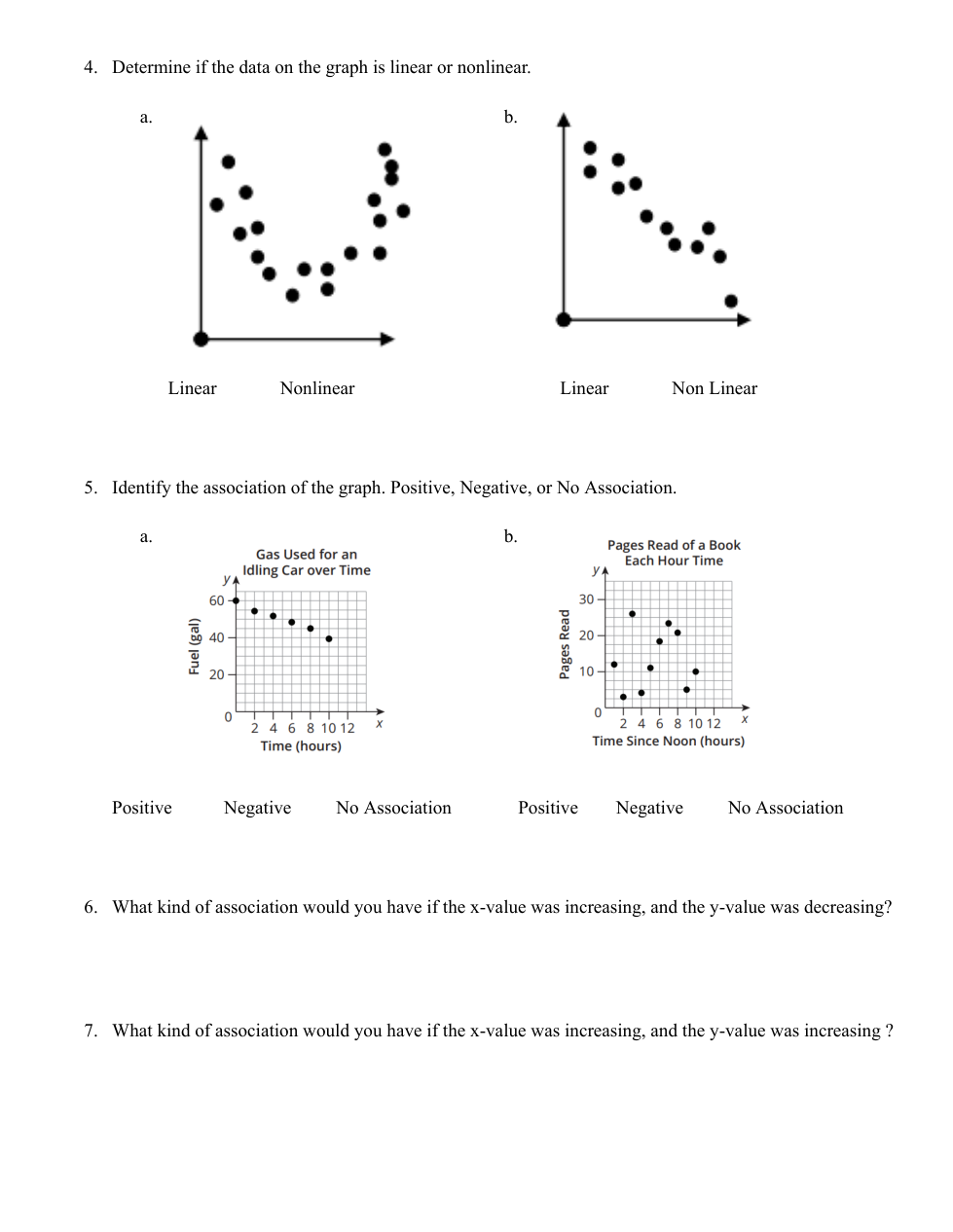
6. What kind of association would you have if the x-value was increasing, and the y-value was decreasing?
7. What kind of association would you have if the x-value was increasing, and the y-value was increasing?
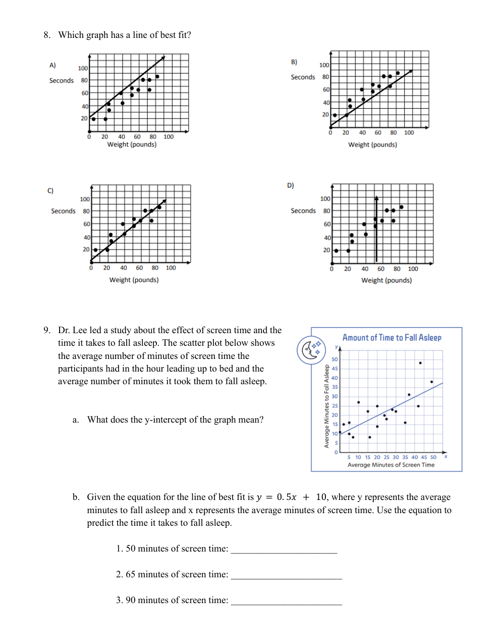
8. Which graph has a line of best fit?
9a. What does the y-intercept of the graph mean?
9b. Given the equation for the line of best fit is y = 0.5x + 10, where y represents the average minutes to fall asleep and x represents the average minutes of screen time. Use the equation to predict the time it takes to fall asleep.
1. 50 minutes of screen time:
2. 65 minutes of screen time:
3. 90 minutes of screen time:
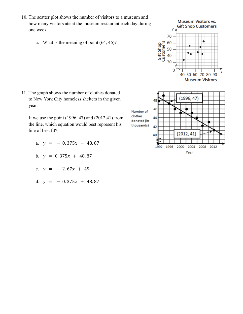
10a. The scatter plot shows the number of visitors to a museum and how many visitors shopped at the gift shop each day during one week.
What is the meaning of point (64, 46)?
11. The graph shows the number of clothes donated to new your city homeless shelters in the given year.
If we use the point (1996,47) and (2012, 41) from the line, which equation would best represent his line of best fit?
2b. What type of association does the scatter plot show?
3. Does the data of the graph below have an outlier? If yes, then circle the outlier.
4a. Determine if the data on the graph is linear or nonlinear.

4b. Determine if the data on the graph is linear or nonlinear.

5a. Identify the association of the graph.

5b. Identify the association of the graph.
