1
2
3
4
21
22
25
29
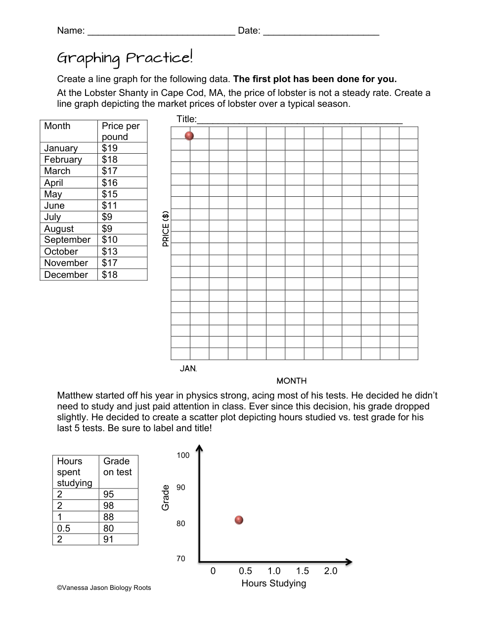
What is the graph showing from January to May?
Increase
Decrease
Stay the same
Breast Cancer
Lung Cancer
Skin ( basal)
Skin (melonoma)
Prostate Cancer
Colon Cancer
180
180000
40
140000
Line graph
Pie graph
Bar graph
5%
10%
15%
25%
Fraser Fir
White Pine
Nible Fir
Colorado Blue Spruce
28 cm
30 cm
32 cm
42 cm
3 hours
6 hours
9 hours
12 hours
What is the graph showing from May to July?
Stay the Same
What is the graph showing from July to August?
What is the graph showing from July to December?
What is the trend you notice between grade and hours studying?
I don't know I didn't do my graph
The more time spent studying the lower grade
The more time spent studying the higher the grade
There is no correlation between the two