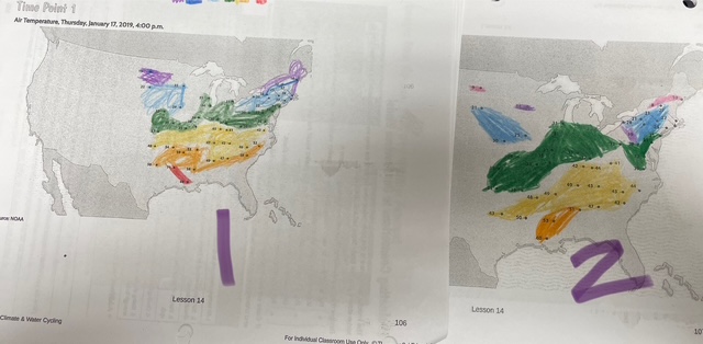
What is the title of this map?
What is the name of the data on the chart?
Are the data for cities across the whole United States?
Where is it colder?
Where does it seem warmer?
Do you think the time of day affects the temperature outside?
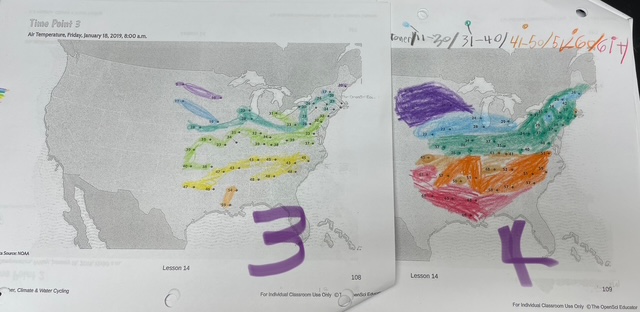
Now look at maps 3 and 4. Make 2 observations of what you see different between the two maps. You can mention location or the temperature with numbers.
How can you tell where the temperatures change?
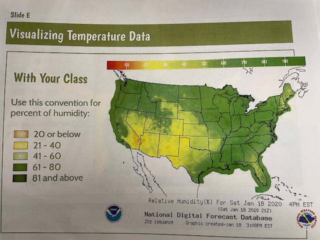
Do you think there will be more humidity or less humidity in the warmer sections of the United States?
What data does this map show?
What does relative humidity measure?
Where does it seem most humid?
Where does it seem less humid?
Identify one connection you can make between relative humidity and temperature.
How can meterologists use data maps like this?