1
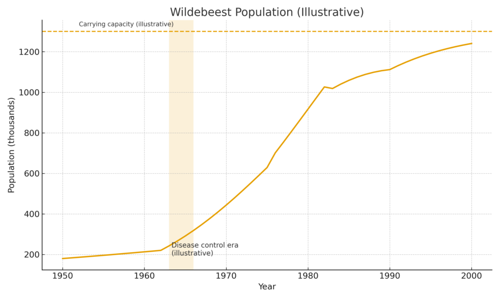
What does the dotted line represent in the graph?
What does the dotted line represent in the graph?
1
1
1
What patterns have we noticed so far in wildebeest numbers and their environment?
When you have completed your response, put give the teacher a thumbs up response. Be prepared to share.
(5 minutes)
What does the dotted line represent in the graph?
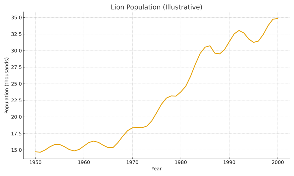
What trend does the lion population show from 1950 to 2000?
What does the orange line represent in the graph?
Curve Analysis
Where is the growth exponential? Where does it level off?
What evidence shows the carrying capacity?
Limiting Factors
What biotic or abiotic factors could make the wildebeest population overshoot carrying capacity and then drop below it?
Predator–Prey Interdependence
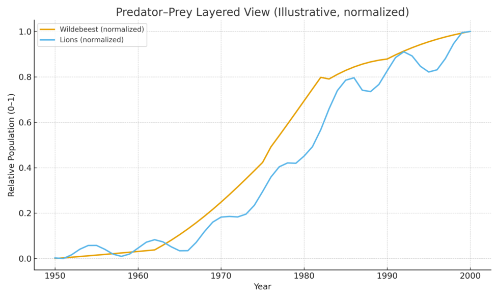
Compare the lion graph to the wildebeest graph.
How do changes in the wildebeest population affect lions?
Predict what would happen if the apex predator (lions) were removed.
Direct Impact:
How might this development affect the wildebeest and lion populations in the short and long term?
Interactions & Feedbacks:
How could changes in these two key populations ripple through predator–prey relationships and the overall food web?
Costa’s Level 3 – Predictive Thinking:
Based on what you know about energy flow and ecosystem dynamics, predict how other components of the ecosystem—such as plant communities, scavengers, smaller herbivores, and soil nutrient cycles—might change if the resort is built. What evidence or reasoning supports your prediction?
What happened around 1960 according to the graph?
What trend is shown after the disease control era?
What is the general trend of the wildebeest population from 1950 to 2000?
Which decade saw the highest lion population?
How did the lion population change from 1960 to 1970?
What was the lion population around 1980?
What trend is seen in lion population from 1950 to 2000?
What is the relationship between lions and wildebeests in this graph?
What does the y-axis represent in the graph?