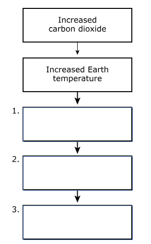
Changes in the concentration of carbon dioxide in the atmosphere impacts global sea level.
Rising carbon dioxide (CO2) levels are correlated with rising atmospheric temperatures. Researchers collected data, shown in Figures 1 and 2, on atmospheric carbon dioxide and global sea level.


1
Which question is best addressed by analyzing the data?
Which question is best addressed by analyzing the data?
DCI.ESS2.A.9-12.6
DCI.ESS2.A.9-12.7
+5