The graph below shows the percentage of 1,000 students who voted for each animal to be their school mascot.

How many more students chose Bears over Eagles?
The graph below shows the percentage of 1,000 students who voted for each animal to be their school mascot.
How many more students chose Bears over Eagles?
 Which statement is best supported by the information in the box plots?
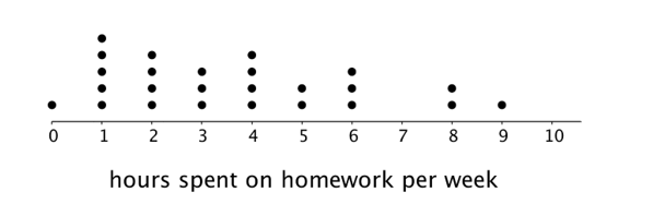
 Which statement is best supported by the information in the dot plots?
 Which statement is supported by the information on the dot plots?
