Heat-Related Deaths
Key Points
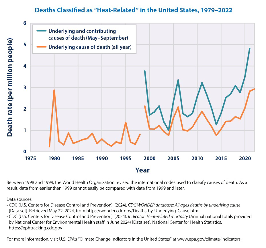
Between 1979 and 2022, the death rate as a direct result of exposure to heat (underlying cause of death) generally hovered between 0.5 and 2 deaths per million people, with spikes in certain years (see Figure 1). Overall, a total of more than 14,000 Americans have died directly from heat-related causes since 1979, according to death certificates.
For years in which the two records overlap (1999–2021), accounting for those additional deaths in which heat was listed as a contributing factor results in a higher death rate - nearly double for some years - compared with the estimate that only includes deaths where heat was listed as the underlying cause (see Figure 1).
The indicator shows heat-related deaths reaching new highs in 2021 and 2022, which were two of the hottest years on record in the contiguous 48 states (see the U.S. and Global Temperature indicator) and featured several notable heat waves.
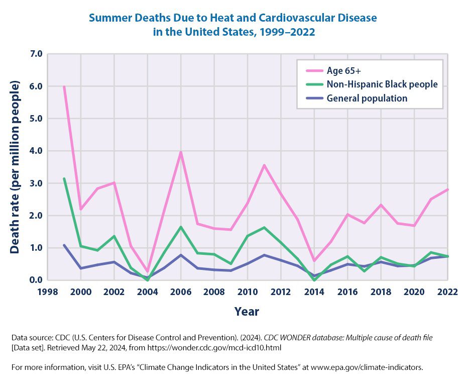
The death rate from heat-related cardiovascular disease ranged from 0.08 deaths per million people in 2004 to 1.08 deaths per million people in 1999 (see Figure 2). Overall, the interaction of heat and cardiovascular disease caused about one-fifth of the heat-related deaths recorded in the “underlying and contributing causes” analysis since 1999 (see Figures 1 and 2).
Since 1999, people aged 65+ have been several times more likely to die from heat-related cardiovascular disease than the general population, while non-Hispanic Black people generally have had higher-than-average rates (see Figure 2).
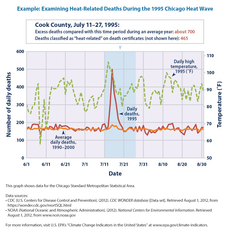
Examination of extreme events has revealed challenges in capturing the full extent of “heat-related” deaths. For example, studies of the 1995 heat wave event in Chicago (see example figure) suggest that there may have been hundreds more deaths than were actually reported as “heat-related” on death certificates.
It is difficult to determine if the United States has experienced a meaningful increase or decrease in deaths classified as “heat-related” over time. While dramatic increases in heat-related deaths are closely associated with the occurrence of hot temperatures and heat waves, deaths may not be reported as “heat-related” on death certificates and there is considerable year-to-year variability in the data.
Background
When people are exposed to extreme heat, they can suffer from potentially deadly illnesses, such as heat exhaustion and heat stroke. Hot temperatures can also contribute to deaths from heart attacks, strokes, and other forms of cardiovascular disease. According to the National Weather Service, heat is a leading weather-related killer in the United States, even though most heat-related deaths are preventable through outreach and intervention.
Unusually hot temperatures have become more common across parts of the United States in recent decades, extreme heat events (heat waves) have become more frequent and intense throughout the country, and these trends are expected to continue. As a result, the risk of heat-related deaths and illness is also expected to increase unless people take steps to mitigate the impact or adapt. The “heat island” effect accentuates the problem by causing even higher temperatures in densely developed urban areas. Reductions in cold-related deaths are projected to be smaller than increases in heat-related deaths in most regions. Death rates can also change, however, as people acclimate to higher temperatures and as communities strengthen their heat response plans and take other steps to continue to adapt.
Certain population groups already face higher risks of heat-related death and increases in summertime temperature variability will increase that risk. The population of adults aged 65 and older, which is expected to continue to grow, has a higher-than-average risk of heat-related death. Children are particularly vulnerable to heat-related illness and death, as their bodies are less able to adapt to heat than adults, and they must rely on others to help keep them safe. People with certain diseases, such as cardiovascular and respiratory illnesses, are especially vulnerable to excessive heat exposure, as are the economically disadvantaged. Data also suggest a higher risk among non-Hispanic Black people.
Graph of Information - Figure 1.
This figure shows the annual rates for deaths classified as “heat-related” by medical professionals in the 50 states and the District of Columbia. The orange line shows deaths for which heat was listed as the main (underlying) cause.* The blue line shows deaths for which heat was listed as either the underlying or the contributing cause of death in May–September, based on a broader set of data that became available in 1999 and could be updated through 2021.
Graph of Information - Figure 2.
This figure shows rates for deaths that medical professionals have classified as being caused by a combination of cardiovascular disease (diseases of the circulatory system) and heat exposure. This graph presents summer (May to September) death rates from 1999 to 2022 for three population groups in the 50 states and the District of Columbia. The blue line shows rates for the entire population, the green line shows rates for non-Hispanic Black people, and the pink line shows rates for people aged 65 and older.
Graph of Information - Figure 3.
Many factors can influence the nature, extent, and timing of health consequences associated with extreme heat events.
* This graph shows data for the Chicago Standard Metropolitan Statistical Area.