Log in
Sign up for FREE
arrow_back
Library

Copy of Analyzing and Making Graphs (5/28/2026)

star
star
star
star
star
Last updated about 3 hours ago
5 questions
1
1
1
1
1
Graphs are used to display information. They are used in many fields, but for scientists, they are critical to the organization and analysis of data. Data displays make it easier to see patterns and make conclusions.

Graph Types

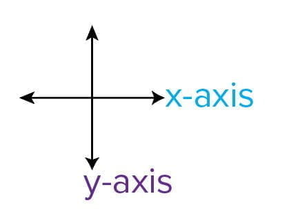
Graphs are one way to show the relationship or patterns in data that is usually first organized into a data table. There are many types of graphs with different reasons to use each type. All graphs have an x-axis and y-axis. The x-axis is the line that runs horizontally (left to right); the y-axis is the line that runs vertically (top to bottom).

Bar Graphs

Bar graphs are typically used to show data from different categories. Usually in a bar graph, only the y-axis has numbers while the x-axis has categories. Both the bar categories and the entire axes are labeled. The x-axis can have numbers, but the numbers would typically represent a category like “number of books read.” The x-axis in a bar graph is not a number line.

In a graph with multiple bars, a key is needed to indicate what each bar set represents. Bars should not be random colors or patterns! The bars should only be colored or patterned to denote a specific type of information to the reader.

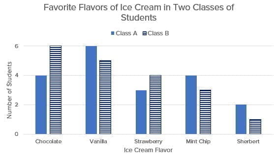
Below is a sample bar graph showing the preferred ice cream flavors of two classes of students. The below graph shows data from two different classes.

Question 1
1.

Line Graphs

Line graphs are often used to show a change over time. In this type of graph, both the x- and y-axes will have numbers. Typically, the x-axis will be labeled with some unit of time measurement. It is critical that the numbers are labeled on the lines of the graph, not in the spaces. The axes should be number lines.

The numbers are labels on specific lines along the number line, not in the spaces.

The intervals between numbers on the axes should be equal in increasing order from the lowest to the highest number in your range of data. The axis should be a number line that includes the entire range of data—not just the numbers in the table.
Question 2
2.

Now let's analyze a few examples of the correct and incorrect ways to number the axes on a line graph.

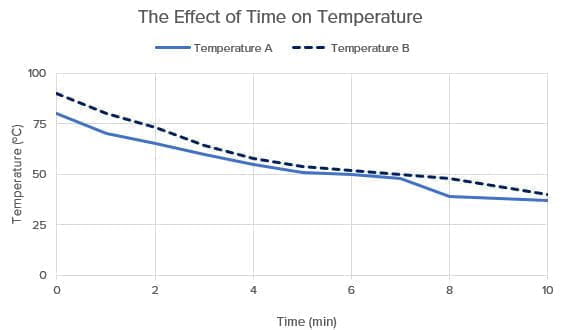
Correct: Example A

The x-axis has a range of 0 to 10, and the interval is 2. The y-axis has a range of 0 to 100, and the interval is 25.

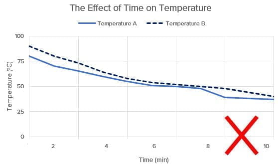
Incorrect: Example B

In this line graph, note how the x-axis is numbered incorrectly, which is indicated by the red X. The numbers appear in the spaces rather than directly below the lines.

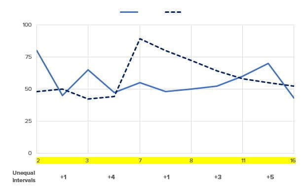
Incorrect: Example C
In this line graph, notice the unequal intervals on the x-axis (highlighted in yellow). The data was plotted as it was collected instead of first creating a number line.
Question 3
3.

In the graph labeled "Example C," the x-axis is numbered incorrectly.
Identify and explain two other errors in that graph shown above.

Pie Charts

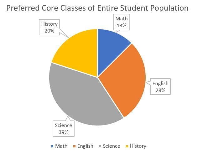
Pie charts are another way to display data. Typically, pie charts are used to show the parts of a whole, or the percentage of a total.

The size of the pie pieces represents the percentages of each response.
Question 4
4.

Scatter Plots

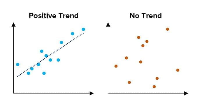
The final graph type discussed in this lesson is the scatter plot. This type of graph is often used when a large pool of data is collected and analyzed for possible correlations or trends. Scatter plots usually have what is called a “line of best fit” that shows the trend for the majority of the data points. A positive trend line goes upward from left to right. It tells the reader that as one variable increases, so does the other. A negative trend goes downward from left to right. It tells the reader that as one variable increases, the other variable decreases.


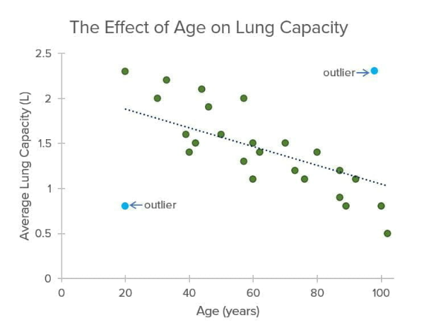
The line of best fit (dashed line) shows the negative trend of the majority of the data points. The blue dots are examples of outliers, or data points that do not align with the trend. Outliers are typically ignored when creating the line of best fit.


The scatter plot on the left shows a positive trend, while the second graph shows no trend.
Question 5
5.

In a bar graph, which axis should have numbers?
X
y
both
neither
Which statement is true about the x-axis of a line graph?
It should be a number line including the range of data from the table.
It should show only the numbers in the data table.
It should include negative and positive numbers.
It should be labeled with numbers in the spaces.
Which of the following data would best be displayed by a pie chart?
the number of books read over the summer by each class
the change in temperature from January to December
the percentage of total time spent on homework for each subject
the effect of exercise on heart rate
Imagine you are creating a scatter plot to show the relationship between air temperature and electricity usage. As air temperature increases, so does electricity usage.

What type of trend would represent that correlation?
No Trend
positive trend
negative trend
There is not enough information to determine the trend.