Copy of Graphing and Data Interpretation 1-2 (5/28/2026)
star
star
star
star
star
Last updated about 2 hours ago
10 questions
2
1
2
3
5
3
2
4
3
2.5
Learning Goals:
I can construct appropriate graphs (bar, pie, scatterplot, line graph) to communicate different types of scientific data clearly and effectively.
I can analyze and interpret data displayed visually in charts, diagrams, and graphs in order to draw conclusions and make evidence-based evaluations.
I can identify independent and dependent variables, recognize trends/patterns in data sets, and understand how to display relationships between quantities using graphs.
Question 1
1.
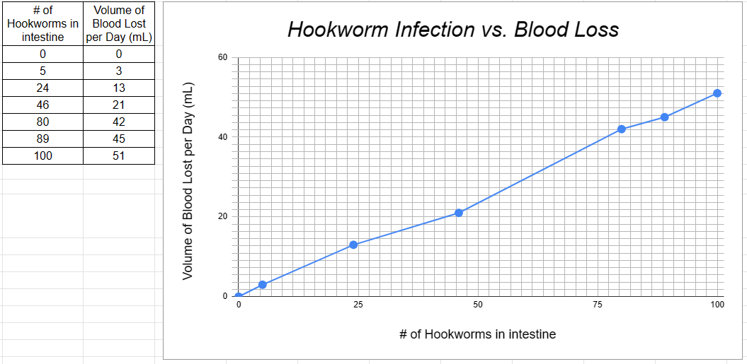
Refer to the above line graph and data table:
a. What is the independent variable from the above data? _______
b. What is the dependent variable? _______
c. If a person has 50 hookworms in their intestines, how much blood would they lose in one day? _______
d. How much blood would be lost by a person containing 10 hookworms in a week? _______
Question 2
2.
What type of graph would you use to display the following data? _______
Question 3
3.
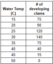
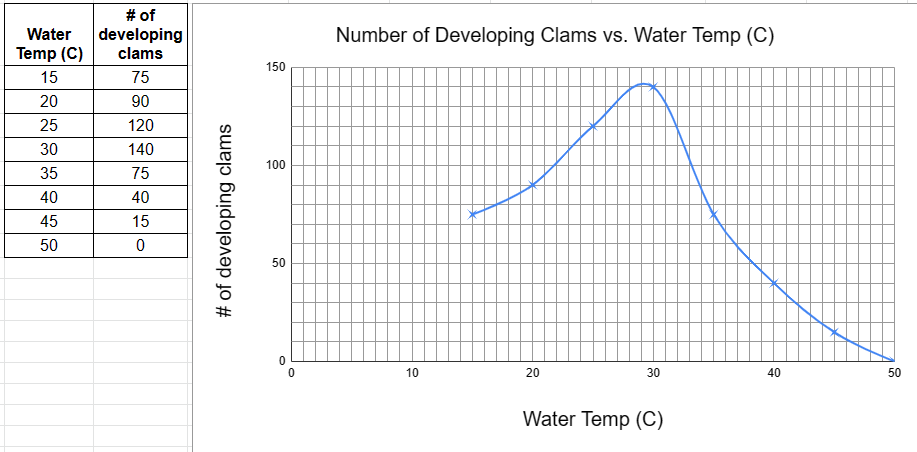
Refer to the above data table and line graph:
a. What is the independent variable? _______
b. What is the dependent variable? _______
c. What is the optimal temperature for clam development? _______
d. Finish this conclusion from the data: "As the temperature increases past 31 degrees Celsius, the number of developing clams _______.
Question 4
4.
Question 5
5.
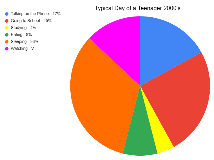
Refer to the above pie graph to answer the following questions:
a. How many hours are in a day? _______
b. What percent represents a whole of anything? _______
c. What percent of the day is spent watching television? _______
d. How many hours are spent watching television? _______
e. How many hours are spent sleeping? _______
f. What activity takes up the least amount of time? _______
g. How many hours does the answer to question 'f' take? _______
h. What activity takes up a quarter of the day? _______
i. What two activities take up 50% of the day? _______
j. What two activities take up 25% of the day? _______
Question 6
6.
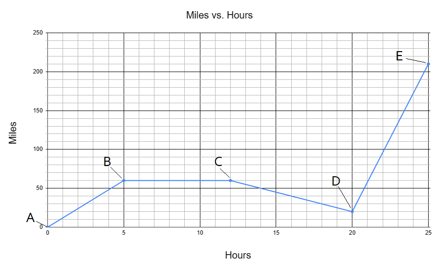
Refer to the above line graph:
a. How many total miles did the car travel? _______
b. What was the average speed (miles/hour) of the car for the entire trip? _______
c. Describe the motion of the car represented by segment BC. _______
d. What direction of the car is represented by segment CD? _______
e. How many miles were traveled in the first two hours of the trip? _______
f. Which segment represents the car traveling the fastest? _______
Question 7
7.
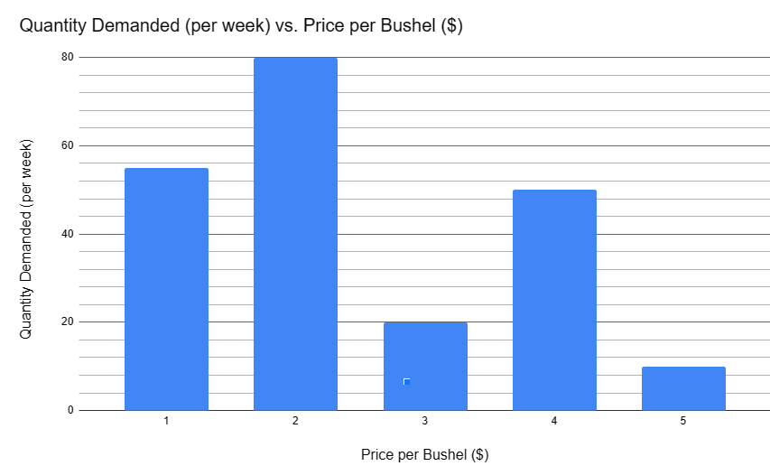
Refer to the bar graph, above:
a. What is the dependent variable? _______
b. Does the price per bushel always influence the demand? _______
c. What is the demand when the price is $5 per bushel? _______
d. What would be the best price to sell this item if you wanted to maximize your total profits? _______
Question 8
8.
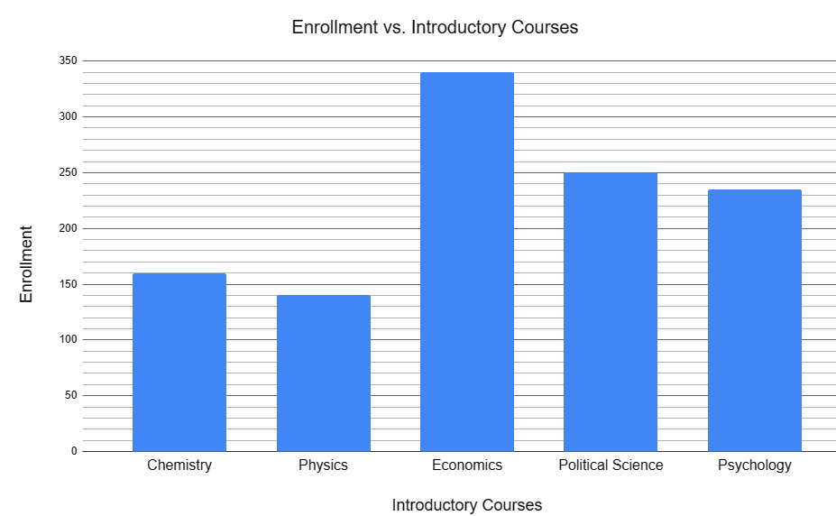
Refer to the above bar graph:
a. What is the total enrollment of the introductory courses? _______
b. How many students are enrolled in physics? _______
c. How many students are enrolled in economics? _______
d. What percentage of students are enrolled in psychology? _______
e. What percentage of students are enrolled in economics? _______
f. How many more students are enrolled in political science than in psychology? _______
g. Which types of introductory courses are the least favored among students (natural sciences or social sciences)? _______
h. What percentage of students are enrolled in natural science courses? _______
Question 9
9.
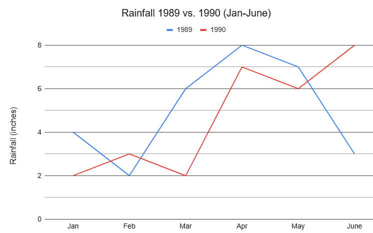
Refer to the above line graph:
a. How much rain fell in March of 1989? _______
b. How much more rain fell in February of 1990 than in February of 1989? _______
c. Which six-month period had the most rainfall? _______
d. What is the wettest month on this record? _______
e. What is the average monthly rainfall for Jan-Jun of 1989? _______
f. What is the average monthly rainfall for Jan-June of 1990? _______
Question 10
10.
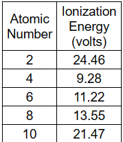
Refer to the above data table:
a. What is the independent variable on the table? _______
b. What is the dependent variable on the table? _______
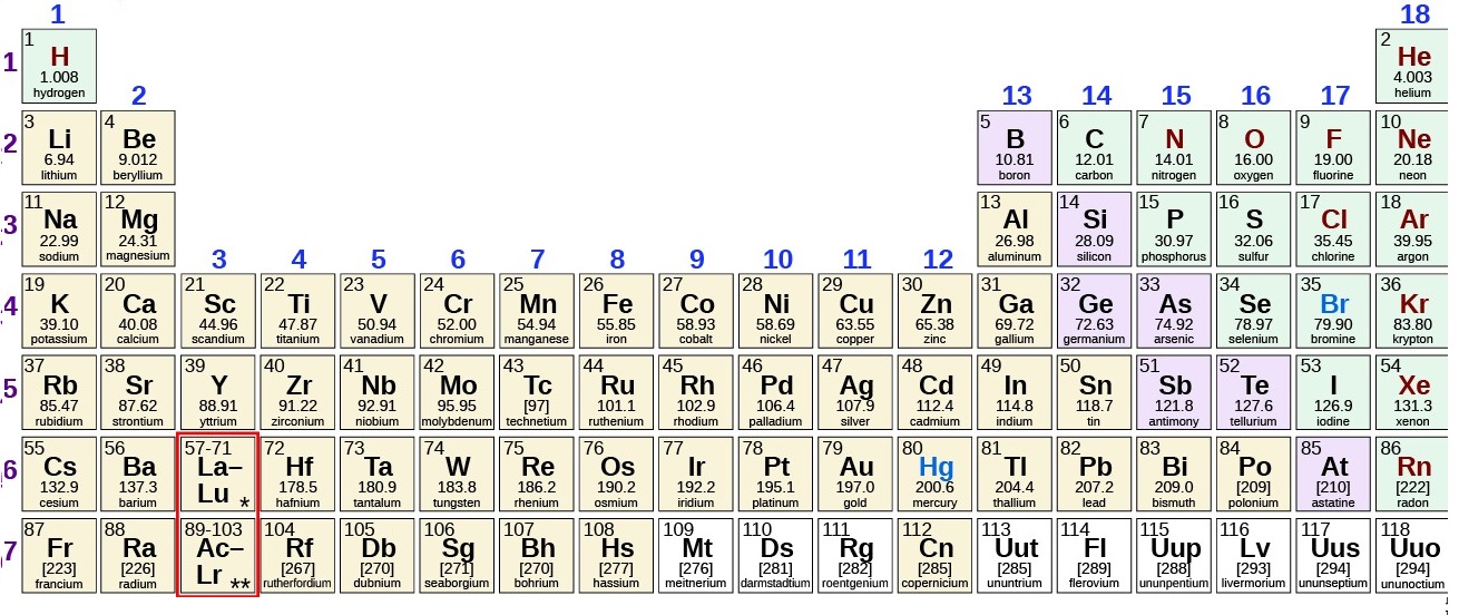
c. How many elements are represented on this data table? _______
d. Which element has the highest ionization energy? _______
e. Describe the shape of the line graph that this data would produce? _______
Experimental Data
Data Tables:
Good data tables can easily be understood without any additional information.
Trouble spots are a lack of complete titles (main title, column titles, and units).
Use metric (SI) units as much as possible.
All data that is collected should be recorded in the data table.
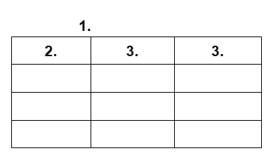
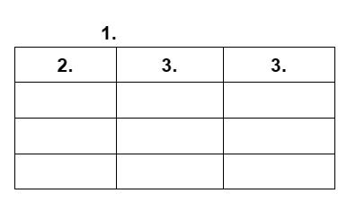
1. Main Title- describes what the table is showing; usually describes a relationship between the independent and dependent variables.
2. Independent Variable - the factor that you change or the factor that is the control. Variables of time are often the independent variable, however, not always. Include any applicable units with the title of the column in the table, instead of next to each number. Placed on the x-axis of the graph (line or bar).
3. Dependent Variable - the factor that changes in response to the independent variable. This is what you are testing and measuring. Include any applicable units with the title of the column in the table, instead of next to each data point. Placed on the y-axis of the graph (line or bar).
Graphs:
A good graph can be understood without any additional information.
Shows the information from the data table in a visual form.
Show units in axes titles and use a key if multiple lines or bars are presented on the graph.
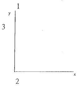
1. Main Title - should be transferred from the data table.
2. Independent Variable - displayed on the x-axis.
3. Dependent Variable - displayed on the y-axis.
Types of Graphs:
Bar - used to compare different or similar things.
Line - used to show how one thing changes (often over time, but not always).
Pie - displays of different things make up a whole (100%).
Analyzing Data (table or graph):
Briefly describe the data.
Indicate any relationships, patterns, or trends between the independent and dependent variables.
If mathematical operations were used to produce the data, include this in your descriptions.
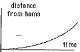
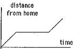
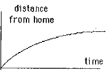
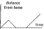
Identify the graph that matches each of the following stories.
I had just left home when I realized I had forgotten my books so I went back to pick them up.
Things went fine until I had a flat tire, but I was soon back on the road.
I started out calmly, but sped up when I realized I was going to be late.